UI Modules
A UI Module is a reusable container that groups widgets, queries, and JavaScript logic into a single unit. It is created inside a UI Package and is designed for reuse across multiple applications.
You can add different types of widgets inside the module container. The entire container is rendered together when the module is used in an application. Widgets inside the module cannot be edited directly from the application. All configurations must be done through defined Inputs.
This page provides information about the properties, content settings, and style configurations available for UI Modules.
Content properties
Content properties control the functional behavior of the UI Module container and its dynamic behavior when rendered inside an application.
Inputs
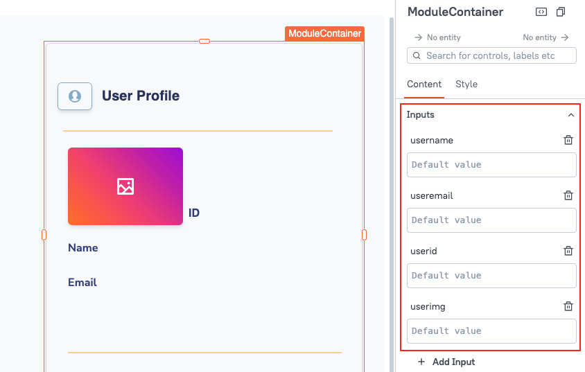
Inputs allow you to pass dynamic values from the application into the UI Module. They act as a bridge between the app and the widgets, queries, or JS logic inside the UI module.
You can create multiple Inputs when designing the module. Each Input has:
-
Name: Used to reference the value inside the module.
-
Default value (optional): Used if no value is passed from the application at runtime.
You can access input values using:
{{inputs.inputName}}
Example 1: If you want to show dynamic data in a widget, bind the property like:
{{inputs.ordersData}}
Example 2: If you want to filter a query using an input value, use:
SELECT * FROM addresses WHERE country = {{inputs.inputCountry}}
On Input Change
Each Input supports an optional onChange configuration that defines what happens when the Input’s value changes during application usage. When you create an Input, a corresponding Input event is also created automatically. You can configure this event to:
- Run one or more queries.
- Call a JavaScript function.
- Chain multiple actions.
All actions defined in this event are executed automatically whenever the input value changes from the application. With this configuration, there is no need to manually configure buttons or widget events to trigger logic. Appsmith automatically runs the associated queries or JavaScript functions as part of the input’s change lifecycle.
Outputs
Outputs allow you to pass dynamic values from the UI Module back to the parent application. They enable modules to share results, state changes, or computed values with the consuming application.
Each Output has:
- Name: Used to reference the value in the parent application.
- Value: The internal module data, state, or computed result you want to expose.
You can access output values using the module instance name from the application:
{{ModuleInstanceName.outputs.outputName}}
Outputs are only accessible in the parent app, not inside the module itself.
Example: If you want to filter a query using a value generated inside the module (e.g., customerId), create an output in the module and access it in your app query:
SELECT * FROM orders WHERE customer_id = {{CustomerModule1.outputs.customerId}}
Visible boolean
Controls whether the entire UI Module container is visible when the application loads. This property applies to the entire module container, not to individual widgets.
To control the visibility of individual widgets, configure the widget’s visibility property individually inside the module.
Scroll Contents boolean
Controls whether the UI Module container allows scrolling when the internal content exceeds the container size. This property applies to the entire module container, not to individual widgets.
Animate Loading boolean
Controls whether a loading animation appears while the UI Module's widgets, queries, or JavaScript logic are initializing. This property applies to the entire module container, not to individual widgets.
Style Properties
Style properties control the appearance of the UI Module container, including background, border, and shadow settings. Some style properties are also JS configurable and can accept dynamic values through Inputs.
Background Color string
Sets the background color of the UI Module container. You can define a static color value or bind a dynamic color using JavaScript expressions.
Background Color is JS configurable and can also be dynamically controlled by passing a color value through an Input.
Border Color string
Sets the color of the border around the UI Module container. Accepts a hex code, RGB value, or color name.
Border Width number
Sets the thickness of the border around the UI Module container.
Default value is 1.
Border Radius string
Controls the roundness of the corners of the UI Module container. Offers three standard options: Sharp (square edge), Rounded (slightly curved), and Pill (fully curved edges).
Border Shadow string
Adds a shadow around the UI Module container to create visual elevation. You can select from three standard shadow options: Small, Medium, and Large.