Custom
While Appsmith provides an extensive array of built-in widgets for application development, there are instances where your project demands a widget tailored to specific requirements. Appsmith's Custom widget allows you to integrate unique functionalities with your HTML, CSS, and JavaScript code for additional functionality.
See How to create Custom widgets.
While Custom widgets support integrating HTML or React components, iframes with src URLs will not be loaded within Custom widgets. To use iframes, consider using the Iframe widget.
Content properties
These properties are customizable options present in the property pane of the widget, allowing users to modify the widget according to their preferences.
Widget
Edit Source
Allows you to customize the code for the custom widget. When clicked, it opens a dedicated page where you can conveniently modify and update the widget's code to suit your requirements.
Learn more about Custom Widget Builder.
Default Model
This property allows you to pass object data to the custom widget's code editor. You can use mustache binding {{}} to pass data from queries or other widgets.
Example: If you want to pass the name from a Table widget to the custom widget, use the following code:
{
  "name": "{{Table1.selectedRow.name}}"
}
-
To access the data in the javascript editor in Custom widget builder page, use
appsmith.model.{property-name}. -
To access data in CSS Editor in Custom widget builder page, use
var(--appsmith-model-{property-name}
General
Visible boolean
Controls the visibility of the widget. If you turn off this property, the widget would not be visible in View Mode. Additionally, you can use JavaScript by clicking on JS next to the Visible property to conditionally control the widget's visibility. The default value for the property is true.
For example, if you want to make the widget visible only when the user selects "Yes" from a Select widget, you can use the following JavaScript expression:
{
  {
    Select1.selectedOptionValue === "Yes";
  }
}
Height string
This property determines how the widget's height adjusts to changes in its content. There are three available options:
- Fixed: The widget's height remains as set using drag and resize.
- Auto Height: The widget's height adjusts dynamically in response to changes in its content.
- Auto Height with limits: Same as Auto height, with a configurable option to set the minimum and maximum number of rows the widget can occupy.
- For the auto height feature to work properly, you should not set height of the container of the custom widget in the source editor. Setting a height will restrict the container from growing as a result the auto height feature will not kick in.
Events
Allows you to create multiple events, providing the flexibility to configure various actions tailored to your specific requirements, such as Framework functions, queries, or JavaScript functions.
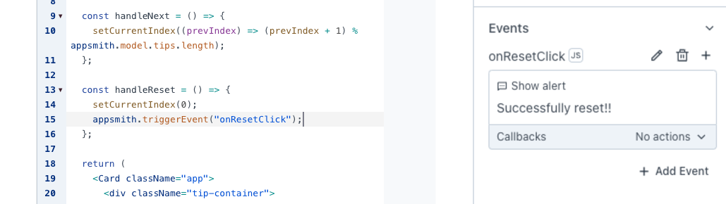
These events can be triggered in the JavaScript code editor of the Custom widget using the appsmith.triggerEvent("eventName").
Example: To trigger an event from the custom widget upon a button click, create a new event named onResetClick and add the following in the JavaScript code:
const handleReset = () => {
  setCurrentIndex(0);
  appsmith.triggerEvent("onResetClick");
};
Reference properties
Reference properties are properties that are not available in the property pane but can be accessed using the dot operator in other widgets or JavaScript functions. They provide additional information or allow interaction with the widget programmatically. For instance, to get the visibility status, you can use Custom1.isVisible.
model string
The model property retrieves the value from the Custom widget and Default Model property.
Example:
{{Custom1.model}}

// Accessing a specific property
{{Custom1.model.signatureImage}}
isVisible boolean
The isVisible property indicates the visibility state of a widget, with true indicating it is visible and false indicating it is hidden.
Example:
{{ Custom1.isVisible }}
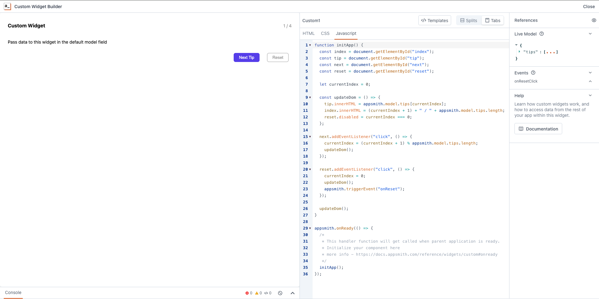
Custom Widget Builder
This section, which you can open by clicking on the edit source button on property pane of the custom widget, provides the Custom Widget Code Editor, which allows you to edit HTML, JS, and CSS code for your custom widgets.
Javascript API
These properties are accessible within the JavaScript editor, providing specific functionalities and customization options.
model object
The model property retrieves the value passed in the Default Model property of the Custom widget.
// Access the entire model
appsmith.model;

// Access a specific property in the model
appsmith.model.propertyname;
mode string
The mode property represents the current render context of the Custom widget.
appsmith.mode;

// Value: EDITOR | BUILDER | DEPLOYED
theme object
The theme object reflects the current theme of the Appsmith application.
primaryColor(string): Represents the primary color of the application theme.backgroundColor(string): Represents the background color of the application theme.borderRadius(string): Specifies the border radius used in the application theme.boxShadow(string): Represents the box shadow applied in the application theme.
appsmith.theme;
ui object
Provides access to the UI elements of the widget, such as width and height, in pixels.
appsmith.ui;
Methods
updateModel
The updateModel property allows you to dynamically update the model properties. This enables real-time synchronization between the Custom widget and the parent application.
Example: If you want to save a signature from a Signature pad custom widget, upon button click, use the following code:
document.getElementById("saveBtn").addEventListener("click", function () {
  var dataURL = signaturePad.toDataURL();
  // Implement logic to save the signature data (e.g., send to server)
  appsmith.updateModel({ signatureImage: dataURL });
});
Once button is clicked, the signature pad data will be available on the custom widget model property. you can use this data in another widget using the {{}} binding.
Example: You can bind signature pad data to an image widget by pasting following code on Image widget's image property on the property pane.
{{ Custom1.model.signatureImage }}
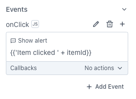
triggerEvent
You can execute custom events that you created in the property pane of the custom widget by calling this function with the name of the event. You can also pass some optional data by including a second argument.
Example: Let's say you have buttons in your custom component, upon clicked, you want to trigger onClick event along the itemId
function onClick() {
  appsmith.triggerEvent("onClick", { itemId: 1 });
}
onModelChange
The onModelChange function allows you to register a handler function, which will be called whenever there is a change in the model, either from the platform or from within the custom widget (for example, via the updateModel function). This is useful for responding to changes in the widget's state.
However, it's important to ensure that changes triggered by your widget's own updates don't lead to infinite loops. You can handle this by adding a condition to check if the relevant part of the model has actually changed before performing any updates.
Example:
// Monitor changes in the model (e.g., dropdown selection)
const unlisten = appsmith.onModelChange((newModel) => {
  // Compare the selected item and update if there's a change
  if (newModel.selectedItem !== appsmith.model.selectedItem) {
    // Update the display only if the selected item has changed
    setSelectedItem(newModel.selectedItem);
  }
});

// Event listener to update the model when the dropdown value changes
document.getElementById("itemSelect").addEventListener("change", function(event) {
  appsmith.model.selectedItem = event.target.value;
  setSelectedItem(event.target.value); // Ensure immediate update on change
});

// Unsubscribe when no longer interested in updates (optional in this simple case)
unlisten();
When the condition is applied, updates occur only when the selected item changes, preventing unnecessary updates and avoiding infinite loops. When you're no longer interested in listening to the model change , call the return value of the appsmith.onModelChange function.
onUiChange
Allows a handler function to be called whenever the UI changes i.e width, height, providing a useful mechanism for updating components affected by UI changes from the platform.
  const unlisten = appsmith.onUiChange((ui) => {
    setComponentWidth(ui.width);
  });

  // Unsubscribe when no longer interested in updates.
  unlisten();
onReady
The onReady event in Appsmith is a mechanism to wait for the parent application to complete its initialization before executing custom widget logic. Use appsmith.onReady to pass a handler function. This handler gets called when the parent application is ready, and you should begin rendering your component from this handler.
appsmith.onReady(() => {
  /* you need to initiate the component here, for example,
   * if you have a react component - call reactDom.render here
   * if you have vanila JS component - call the contructor or initiate here
   */
});
- Initializing your component inside the onReady handler function is very important as it makes sure that the parent application is ready to communicate with your custom component before initialization.
onThemeChange
The onThemeChange function allows theme changes from the application to be applied to a Custom widget. It triggers a callback whenever the theme changes, allowing your widget to automatically reflect the updated design and style. The following theme properties are accessible:
primaryColor: Represents the primary color of the application theme. For example,#FF5733.backgroundColor: Represents the background color of the application theme. For example,#f0f0f0.borderRadius: Represents the border radius for rounded corners in the theme. For example,0pxor1.5rem.borderShadow: Represents the shadow applied to borders in the theme. For example,0px 4px 6px rgba(0, 0, 0, 0.1).
If you no longer need to listen for theme changes, you can unsubscribe by calling the function as a return statement to onThemeChange (e.g., unlisten()).
Example: If you want to create a button that adapts to the application's theme properties, you can use the onThemeChange function to dynamically apply styles like primary color, background color, border radius, and shadow.
function ThemedButton() {
	const [themeStyles, setThemeStyles] = React.useState({});

	React.useEffect(() => {
		// Listen for theme changes and update button styles
		const unlisten = appsmith.onThemeChange((theme) => {
			setThemeStyles({
				color: theme.primaryColor,
				backgroundColor: theme.backgroundColor,
				borderRadius: theme.borderRadius,
				boxShadow: theme.borderShadow,
			});
		});
		return () => unlisten(); // Clean up listener on unmount
	}, []);

	return (
		<Button style={themeStyles}>Next</Button>
	);
}
CSS API
These css variables are accessible within the CSS editor, offer specific functionalities and customization options. The variables fall into three groups: model variables, UI variables, and theme variables. Appsmith updates the values of these properties when the corresponding source changes.
model
The model property retrieves the value passed in the Default Model property of the Custom widget. Appsmith automatically generates corresponding CSS variables for each string and number property within your model. This feature is beneficial for transmitting CSS configurations, such as width or color, through your model.
/* CSS Variable Naming Convention: --appsmith-model-<property-name> */

// For instance, with the following Default Model:
{
	"mainColor": "#000",
	"borderWidth": "1px"
}

// Appsmith automatically creates the corresponding variables:
--appsmith-model-mainColor
--appsmith-model-borderWidth

// Utilize them as follows:
button {
	background-color: var(--appsmith-model-mainColor);
	border: var(--appsmith-model-borderWidth) solid var(--appsmith-model-mainColor);
}
UI and theme
These CSS variables, available to control widget size and define the theme:
ui: representing the height and width of the widget in pixels.theme: representing the selected theme of your application.
//Widget size
--appsmith-ui-width;
--appsmith-ui-height;

//Application theme
--appsmith-theme-primaryColor;
--appsmith-theme-backgroundColor;
--appsmith-theme-borderRadius;
--appsmith-theme-boxShadow;
--appsmith-ui-width and --appsmith-ui-height are number types, to convert them to px, you can use
calc(var(--appsmith-ui-width) * 1px)
See also
If you’re looking to explore more, these guides are a great next step:
- Create Custom Widgets Using React - Explore how to create custom widgets using React to add complex functionality to your app.
- Create Custom Widgets Using Vanilla JS - Learn how to build custom widgets using Vanilla JS for lightweight and flexible customization.