Tabs
This page provides information on using the Tabs widget to organize related content and allow users to switch between different sets of information within a single container.
Content properties
These properties are customizable options present in the property pane of the widget, allowing users to modify the widget according to their preferences.
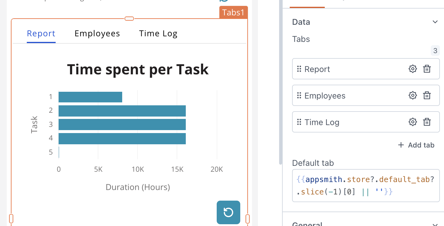
Data
Tabs string
Allows you to manage tabs within the widget, where each tab is identified by a unique name. You can rearrange the tabs items and configure their visibility by clicking on the gear icon ⚙️.
Default Tab string
Allows you to specify a default tab by its name, which is automatically displayed when the widget loads. Make sure the Tab name is exactly as specified.
General
Visible boolean
Controls the visibility of the widget. If you turn off this property, the widget would not be visible in View Mode. Additionally, you can use JavaScript by clicking on JS next to the Visible property to conditionally control the widget's visibility. The default value for the property is true.
For example, if you want to make the widget visible only when the user selects "Yes" from a Select widget, you can use the following JavaScript expression:
{{Select1.selectedOptionValue === "Yes"}}
Animate Loading boolean
This property controls whether the widget is displayed with a loading animation. When enabled, the widget shows a skeletal animation during the loading process. Additionally, you can control it through JavaScript by clicking on the JS next to the property. The default value for the property is true.
Show tabs boolean
This option enables you to toggle the visibility of tabs. The default value for the property is true.
Height string
This property determines how the widget's height adjusts to changes in its content. There are three available options:
- Fixed: Maintains a constant height for the widget, allowing you to adjust it by dragging or using the resize handle.
- Auto Height: The widget's height adjusts dynamically in response to changes in its content.
- Auto Height with limits: Same as Auto height, with a configurable option to set the minimum and maximum number of rows the widget can occupy.
Events
onTabSelected
Specifies the action (Framework functions, queries, or JS functions) to be performed when the user selects a tab.
Style properties
Style properties allow you to change the look and feel of the widget.
Colors, Borders and Shadows
Accent color string
Represents the color of the tab, specified as a CSS color value. Additionally, the color can be programmatically modified using JavaScript functions.
Background Color string
Sets the background color of the widget, specified as a CSS color value. It can also be manipulated programmatically using the JavaScript functions.
Border color string
Sets a color for the border, specified as a CSS color value. It can also be manipulated programmatically using the JavaScript functions.
Border Width number
Specifies the width of the widget's border, accepting only numerical values in pixels (px). The default value is 1.
Border radius string
Applies rounded corners to the outer edge of the widget. If JavaScript is enabled, you can specify valid CSS border-radius to adjust the radius of the corners.
Box Shadow string
This property adds a drop shadow effect to the frame of the widget. If JavaScript is enabled, you can specify valid CSS box-shadow values to customize the appearance of the shadow.
Reference properties
Reference properties are properties that are not available in the property pane but can be accessed using the dot operator in other widgets or JavaScript functions. They provide additional information or allow interaction with the widget programmatically. For instance, to get the visibility status, you can use Tabs2.isVisible.
selectedTab string
Contains the name of the tab currently selected.
Example:
{{Tabs1.selectedTab}}
isVisible boolean
Reflects whether the widget is visible or not.
Example:
{{Tabs1.isVisible}}
Methods
Widget property setters enable you to modify the values of widget properties at runtime, eliminating the need to manually update properties in the editor.
These methods are asynchronous and return a Promise. You can use the .then() block to ensure execution and sequencing of subsequent lines of code in Appsmith.
setVisibility (param: boolean): Promise
Sets the visibility of the widget.
Example:
Tabs1.setVisibility(true)
See also
-
Browse and Display Documents – Learn how to implement functionality for browsing and displaying documents within your app.
-
Create a Multi-step Wizard – See how to create a multi-step form or wizard using Tabs to gather information in a structured manner.