Chart
This page provides information on how to use the Chart widget to visualize and represent data to create admin panels, dashboards, and other data-driven applications.
Content properties
These properties are customizable options present in the property pane of the widget, allowing users to modify the widget according to their preferences.
Data
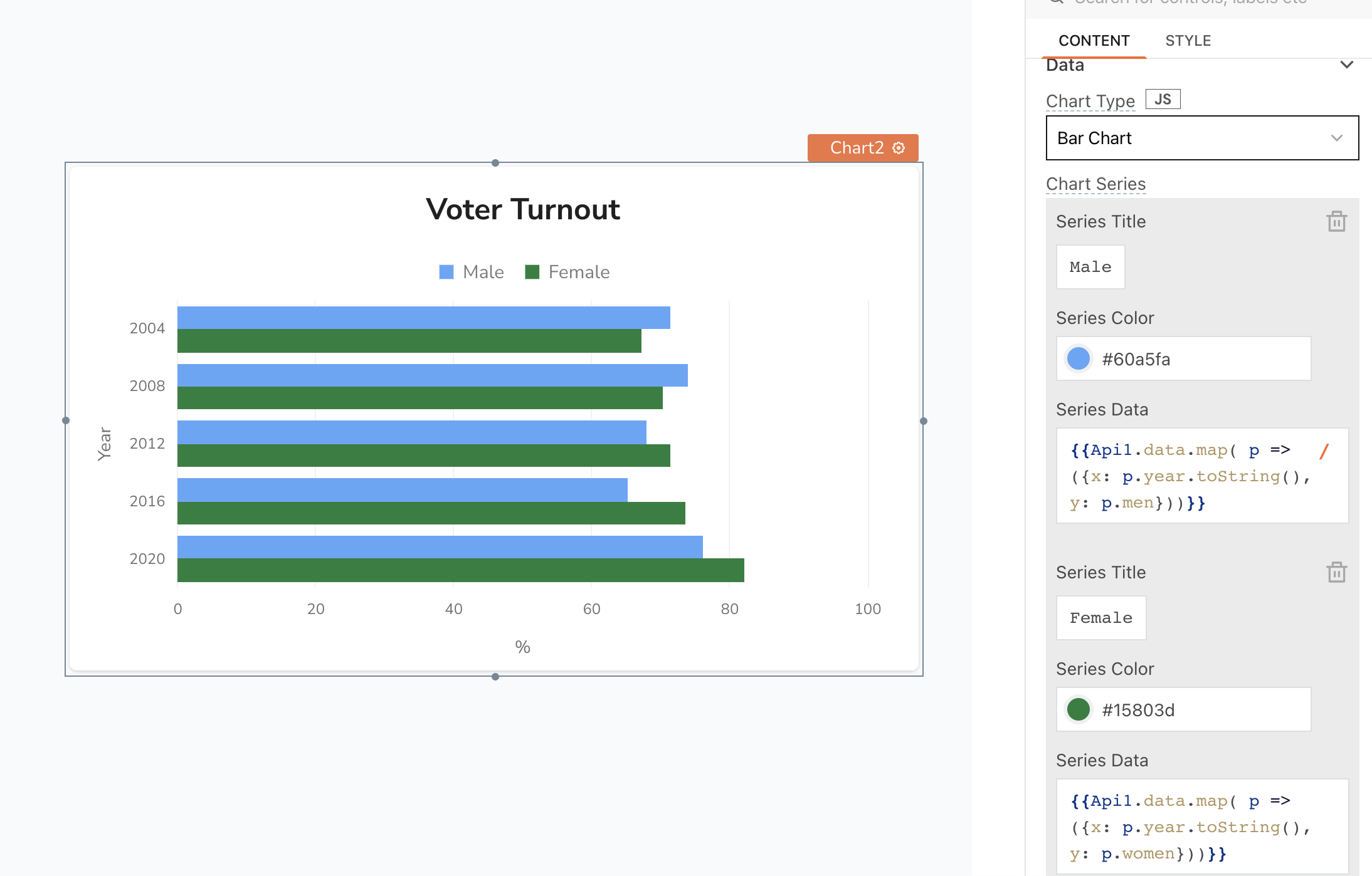
Chart Type string
Allows you to choose from a variety of built-in chart types to visualize your data. Each chart type has its own unique way of representing data, allowing you to choose the most suitable visualization for your specific needs. Here are the available chart types:
- Line Chart
- Bar Chart
- Pie Chart
- Column Chart
- Area Chart
- Custom ECharts
- Custom Fusion Chart
Series title string
Sets the title of the current Chart series. This property is not available for Custom charts.
Series color string
Sets the color of the current Chart series. This property is not available for Custom charts.
Series data array<object>
Allows you to display data in the built-in charts, provide the data in the following structure:
Expected data structure:
[
  {
    "x": "Product1",
    "y": 20000
  },..
]
In this format, x denotes the label, and y denotes the value. Additionally, you can display dynamic data from queries or JS functions by binding the response to the Series Data property. For example, if you have a query named fetchData, you can bind its response using:
Example:
{{fetchData.data}}
If the query data is not in the expected format, you can use the map() function to transform it before passing it to the widget, like:
Example:
{{fetchUserData.data.map( p => ({x: p.gender, y: p.count}))}}
If the query fails and there is no default data specified, the chart doesn't render and appears empty.
Add Series string
Allows you to add multiple chart series. With this you can populate the chart with different sets of data and customize various aspects of its appearance, such as colors and labels.
Custom EChart Configuration
ECharts is a JavaScript chart library by Apache that provides a wide range of chart types.
To display an ECharts in Appsmith, you can integrate it by embedding the ECharts code using mustache syntax, {{<your-chart-data>}} in the Custom EChart Configuration property, like:
Expected data structure:
//Basic line chart format
{
 xAxis: {
    type: 'category',
    data: ['Mon', 'Tue', 'Wed', 'Thu', 'Fri', 'Sat', 'Sun']
  },
  yAxis: {
    type: 'value'
  },
  series: [
    {
      data: [150, 230, 224, 218, 135, 147, 260],
      type: 'line'
  }]}
-
xAxis specifies the type of data on the x-axis. For instance, you can use
categoryas thetypeand provide an array of labeled values in thedatafield. The xAxis field is limited to specific chart types. -
yAxis specifies the type of data on the y-axis. For instance, to display values on the y-axis, you can set the
typeasvalue. The yAxis field is limited to specific chart types. -
series defines the data points and the type of chart:
- type: You can specify the type of chart you want to display, such as
linefor a line chart orbarfor a bar chart. - data: Contains an array of values or categories, depending on the chart type. Alternatively, you can dynamically update the data using mustache syntax, like
{{Query1.data}}, enabling real-time data integration from external sources or queries, provided the data format aligns with the chart type's requirements.
- type: You can specify the type of chart you want to display, such as
See how to create a Custom EChart.
Custom Fusion Chart
Effective from March 1st, 2024, Custom Fusion Charts will display a watermark as the license will not be renewed. It is recommended to start using Custom ECharts.
Allows you to add data for Custom charts. You need to specify type for chart type and dataSource for the data to create a custom FusionChart. Below is an example of a configuration for the Custom Fusion Chart property:
Expected data structure:
{
  "type": "",
  "dataSource": {
    "chart": {},
    "data": []
  }
}
-
Type : FusionCharts allows using JavaScript aliases for chart types. FusionCharts provides an extensive range of chart variants, with almost 100+ options to choose from. For example:
"type": "column2d" -
Datasource : The datasource defines the customization options and data points necessary for creating a chart, should be defined in JSON format. It consists of attributes such as chart and data, which may vary depending on the chart type.
Each chart type has different configurations and options. To learn more about these charts and their specific configurations, you can refer to the official FusionCharts documentation. Copy the relevant code examples provided in the documentation and paste them into your project for easy implementation.
General
Title string
Sets the text that appears at the top of the chart as a title.
Visible boolean
Controls the visibility of the widget. If you turn off this property, the widget would not be visible in View Mode. Additionally, you can use JavaScript by clicking on JS next to the Visible property to conditionally control the widget's visibility.
For example, if you want to make the widget visible only when the user selects "Yes" from a Select widget, you can use the following JavaScript expression:
{{Select1.selectedOptionValue === "Yes"}}
Animate Loading boolean
This property controls whether the widget is displayed with a loading animation. When enabled, the widget shows a skeletal animation during the loading process. Additionally, you can control it through JavaScript by clicking on the JS next to the property.
Axis
Adaptive Axis boolean
Determines the scaling behavior of the y-axis.
- OFF: The y-axis begins at zero and spans to an upper limit based on the data points;
- ON: The y-axis starting and ending values are both determined based upon the data points.
Events
onDataPointClick
Specifies an action to be performed when a user clicks on a data point in the chart.
Style properties
Style properties allow you to change the look and feel of the widget.
Border and shadow
Border radius string
Applies rounded corners to the outer edge of the widget. If JavaScript is enabled, you can specify valid CSS border-radius to adjust the radius of the corners.
Box Shadow string
This property adds a drop shadow effect to the frame of the widget. If JavaScript is enabled, you can specify valid CSS box-shadow values to customize the appearance of the shadow.
Reference properties
Reference properties are properties that are not available in the property pane but can be accessed using the dot operator in other widgets or JavaScript functions. They provide additional information or allow interaction with the widget programmatically. For instance, to get the visibility status, you can use Chart1.isVisible.
xAxisName string
Contains the text of the x-axis Label setting of the chart.
Example:
{{Chart1.xAxisName}}
yAxisName string
Contains the text of the y-axis Label setting of the chart.
Example:
{{Chart1.yAxisName}}
chartData array<object>
Displays all the data related to the chart.
Example:
{{Chart1.chartData}}
selectedDataPoint object: x, y, seriesTitle
Contains an object which represents the data point that the user has most recently clicked (object containing: x, y, seriesTitle).
Example:
//To access all the details of the selected data point:
{{Chart1.selectedDataPoint}}

//To access the label of the selected data point:
{{Chart1.selectedDataPoint.x}}

//To access the value of the selected data point:
{{Chart1.selectedDataPoint.y}}
isVisible boolean
Reflects whether the widget is visible or not.
Example:
{{Chart1.isVisible}}
See also
- Plot Chart With Filters - Learn how to plot charts and add filters to visualize your data effectively.
- Create Custom Charts - See how to create custom charts to suit your app's needs.
- Monitor App Usage – See how to monitor app usage and track performance metrics in real-time using Chart widget.