Map Chart
This page provides information on using the Map Chart widget for data visualizations on maps. The visualizations can be used in dashboards to denote areas of interest.
Content properties
These properties are customizable options present in the property pane of the widget, allowing users to modify the widget according to their preferences.
Data
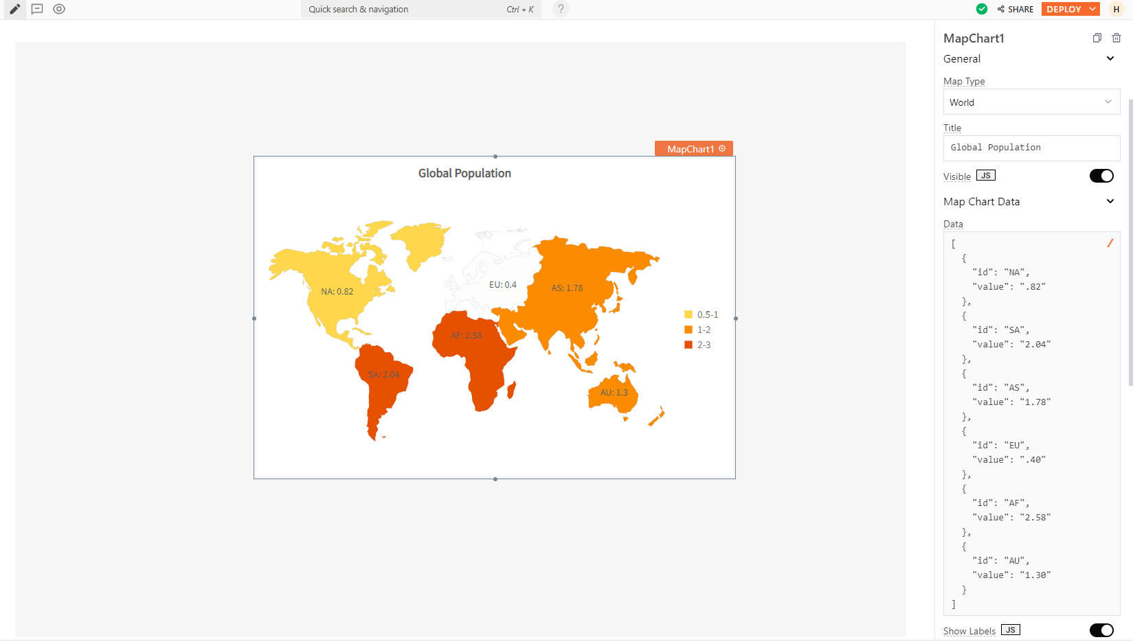
Map Type string
Allows you to choose between world maps or individual continent maps for visualizing your data.
Options:
- World
- World with Antarctica
- Europe
- North America
- South America
- Asia
- Oceania
- Africa
- USA
If you want to display a different Map type not listed above, like specific locations, countries, or cities, please contact the support team using the chat widget at the bottom right of this page.
Chart Data array<object>
Allows you to display data in the chart.
Expected data structure:
[
  {
    "id": "AK",
    "value": "1.96"
  },
  {
    "id": "AL",
    "value": "2.22"
  },..
]
In this format, the id refers to the pre-defined label ID, and the value represents the corresponding value associated with that label. If a label ID has no corresponding value, the map displays grey color, to signify the absence of data.
Each Map Type has different configurations. To learn more about these charts and their specific configurations, you can refer to the Region and Country codes section.
Additionally, you can display dynamic data from queries or JS functions by binding the response to the Chart data property. For example, if you have a query named fetchData, you can bind its response using:
Example:
{{fetchData.data}}
If the query data is not in the expected format, you can use the map() function to transform it before passing it to the widget, like:
Example:
{{fetchUserData.data.map( p => ({id: p.label, value: val.count}))}}
Title string
Sets the text that appears at the top of the chart as a title.
Visible boolean
Controls the visibility of the widget. If you turn off this property, the widget would not be visible in View Mode. Additionally, you can use JavaScript by clicking on JS next to the Visible property to conditionally control the widget's visibility.
For example, if you want to make the widget visible only when the user selects "Yes" from a Select widget, you can use the following JavaScript expression:
{{Select1.selectedOptionValue === "Yes"}}
Show Labels boolean
When enabled, displays labels for each data point featured on the Map chart.
Events
onDataPointClick
Sets the action (Framework functions, queries, or JS functions) to be executed when a user clicks on a data point in the chart.
Style properties
Style properties allow you to change the look and feel of the widget.
General
Color range array<object>
Allows you to manage the color of a collection of regions based on the assigned value ranges. It accepts arrays of objects containing the following keys:
code: Represents the color code to be applied.minValue: Indicates the minimum value where this color should be used.maxValue: Indicates the maximum value where this color should be used.displayValue: Display string values, overriding the numeric range.alpha: Indicates the transparency level, with a maximum value of 100.
Expected data structure:
[
  {
    "minValue": 0.5,
    "maxValue": 1,
    "code": "#FFD74D"
  },
  {
    "minValue": 1,
    "maxValue": 2,
	"displayValue": "Hello",
	"alpha": 32,
    "code": "#FB8C00"
  },..
]
Border and shadow
Border radius string
Applies rounded corners to the outer edge of the widget. If JavaScript is enabled, you can specify valid CSS border-radius to adjust the radius of the corners.
Box Shadow string
This property adds a drop shadow effect to the frame of the widget. If JavaScript is enabled, you can specify valid CSS box-shadow values to customize the appearance of the shadow.
Reference properties
Reference properties are properties that are not available in the property pane but can be accessed using the dot operator in other widgets or JavaScript functions. They provide additional information or allow interaction with the widget programmatically. For instance, to get the visibility status, you can use MapChart1.isVisible.
selectedDataPoint object
Contains an object which represents the data point that the user has most recently clicked.
Example:
//To access all the details of the selected data point:
{{MapChart1.selectedDataPoint}}

//To access the label of the selected data point:
{{MapChart1.selectedDataPoint.id}}

//To access the value of the selected data point:
{{MapChart1.selectedDataPoint.value}}
isVisible boolean
Reflects whether the widget is visible or not.
Example:
{{MapChart1.isVisible}}
Methods
Widget property setters enable you to modify the values of widget properties at runtime, eliminating the need to manually update properties in the editor.
These methods are asynchronous and return a Promise. You can use the .then() block to ensure execution and sequencing of subsequent lines of code in Appsmith.
setVisibility (param: boolean): Promise
Sets the visibility of the widget.
Example:
MapChart1.setVisibility(true)
Region and country codes
| Map Type | ID | Value |
|---|---|---|
| WORLD | AF | Africa |
| WORLD | AS | Asia |
| WORLD | AU | Australia |
| WORLD | EU | Europe |
| WORLD | NA | North America |
| WORLD | SA | South America |
| WORLD_WITH_ANTARCTICA | AF | Africa |
| WORLD_WITH_ANTARCTICA | AT | Antarctica |
| WORLD_WITH_ANTARCTICA | AS | Asia |
| WORLD_WITH_ANTARCTICA | AU | Australia |
| WORLD_WITH_ANTARCTICA | EU | Europe |
| WORLD_WITH_ANTARCTICA | NA | North America |
| WORLD_WITH_ANTARCTICA | SA | South America |
| EUROPE | 001 | Albania |
| EUROPE | 002 | Andorra |
| EUROPE | 003 | Austria |
| EUROPE | 004 | Belarus |
| EUROPE | 005 | Belgium |
| EUROPE | 006 | Bosnia and Herzegovina |
| EUROPE | 007 | Bulgaria |
| EUROPE | 008 | Croatia |
| EUROPE | 044 | Cyprus |
| EUROPE | 009 | Czech Republic |
| EUROPE | 010 | Denmark |
| EUROPE | 011 | Estonia |
| EUROPE | 012 | Finland |
| EUROPE | 013 | France |
| EUROPE | 014 | Germany |
| EUROPE | 015 | Greece |
| EUROPE | 016 | Hungary |
| EUROPE | 017 | Iceland |
| EUROPE | 018 | Ireland |
| EUROPE | 019 | Italy |
| EUROPE | 047 | Kosovo |
| EUROPE | 020 | Latvia |
| EUROPE | 021 | Liechtenstein |
| EUROPE | 022 | Lithuania |
| EUROPE | 023 | Luxembourg |
| EUROPE | 024 | Macedonia |
| EUROPE | 025 | Malta |
| EUROPE | 026 | Moldova |
| EUROPE | 027 | Monaco |
| EUROPE | 028 | Montenegro |
| EUROPE | 029 | Netherlands |
| EUROPE | 030 | Norway |
| EUROPE | 031 | Poland |
| EUROPE | 032 | Portugal |
| EUROPE | 033 | Romania |
| EUROPE | 046 | Russia |
| EUROPE | 034 | San Marino |
| EUROPE | 035 | Serbia |
| EUROPE | 036 | Slovakia |
| EUROPE | 037 | Slovenia |
| EUROPE | 038 | Spain |
| EUROPE | 039 | Sweden |
| EUROPE | 040 | Switzerland |
| EUROPE | 045 | Turkey |
| EUROPE | 041 | Ukraine |
| EUROPE | 042 | United Kingdom |
| EUROPE | 043 | Vatican City |
| NORTH_AMERICA | 001 | Antigua and Barbuda |
| NORTH_AMERICA | 002 | Bahamas |
| NORTH_AMERICA | 003 | Barbados |
| NORTH_AMERICA | 004 | Belize |
| NORTH_AMERICA | 005 | Canada |
| NORTH_AMERICA | 026 | Cayman Islands |
| NORTH_AMERICA | 006 | Costa Rica |
| NORTH_AMERICA | 007 | Cuba |
| NORTH_AMERICA | 008 | Dominica |
| NORTH_AMERICA | 009 | Dominican Rep. |
| NORTH_AMERICA | 010 | El Salvador |
| NORTH_AMERICA | 024 | Greenland |
| NORTH_AMERICA | 011 | Grenada |
| NORTH_AMERICA | 012 | Guatemala |
| NORTH_AMERICA | 013 | Haiti |
| NORTH_AMERICA | 014 | Honduras |
| NORTH_AMERICA | 015 | Jamaica |
| NORTH_AMERICA | 016 | Mexico |
| NORTH_AMERICA | 017 | Nicaragua |
| NORTH_AMERICA | 018 | Panama |
| NORTH_AMERICA | 025 | Puerto Rico |
| NORTH_AMERICA | 019 | St. Kitts & Nevis |
| NORTH_AMERICA | 020 | St. Lucia |
| NORTH_AMERICA | 021 | St. Vincent & the Grenadines |
| NORTH_AMERICA | 022 | Trinidad & Tobago |
| NORTH_AMERICA | 023 | United States |
| SOUTH_AMERICA | 001 | Argentina |
| SOUTH_AMERICA | 002 | Bolivia |
| SOUTH_AMERICA | 003 | Brazil |
| SOUTH_AMERICA | 004 | Chile |
| SOUTH_AMERICA | 005 | Colombia |
| SOUTH_AMERICA | 006 | Ecuador |
| SOUTH_AMERICA | 007 | Falkland Islands |
| SOUTH_AMERICA | 008 | French Guiana |
| SOUTH_AMERICA | 015 | Galapagos Islands |
| SOUTH_AMERICA | 009 | Guyana |
| SOUTH_AMERICA | 010 | Paraguay |
| SOUTH_AMERICA | 011 | Peru |
| SOUTH_AMERICA | 016 | South Georgia Island |
| SOUTH_AMERICA | 012 | Suriname |
| SOUTH_AMERICA | 013 | Uruguay |
| SOUTH_AMERICA | 014 | Venezuela |
| ASIA | 001 | Afghanistan |
| ASIA | 002 | Armenia |
| ASIA | 003 | Azerbaijan |
| ASIA | 060 | Bahrain |
| ASIA | 005 | Bangladesh |
| ASIA | 006 | Bhutan |
| ASIA | 007 | Brunei |
| ASIA | 008 | Burma (Myanmar) |
| ASIA | 009 | Cambodia |
| ASIA | 010 | China |
| ASIA | 012 | East Timor |
| ASIA | 013 | Georgia |
| ASIA | 050 | Hong Kong |
| ASIA | 051 | India |
| ASIA | 052 | Indonesia |
| ASIA | 053 | Iran |
| ASIA | 054 | Iraq |
| ASIA | 055 | Israel |
| ASIA | 056 | Japan |
| ASIA | 057 | Jordan |
| ASIA | 058 | Kazakhstan |
| ASIA | 059 | Kuwait |
| ASIA | 060 | Kyrgyzstan |
| ASIA | 061 | Laos |
| ASIA | 062 | Lebanon |
| ASIA | 063 | Macau |
| ASIA | 064 | Malaysia |
| ASIA | 065 | Maldives |
| ASIA | 066 | Mongolia |
| ASIA | 067 | Nepal |
| ASIA | 068 | North Korea |
| ASIA | 069 | Oman |
| ASIA | 070 | Pakistan |
| ASIA | 071 | Palestine |
| ASIA | 072 | Philippines |
| ASIA | 073 | Qatar |
| ASIA | 074 | Saudi Arabia |
| ASIA | 075 | Singapore |
| ASIA | 076 | South Korea |
| ASIA | 077 | Sri Lanka |
| ASIA | 078 | Syria |
| ASIA | 079 | Taiwan |
| ASIA | 080 | Tajikistan |
| ASIA | 081 | Thailand |
| ASIA | 082 | Turkey |
| ASIA | 083 | Turkmenistan |
| ASIA | 084 | United Arab Emirates |
| ASIA | 085 | Uzbekistan |
| ASIA | 086 | Vietnam |
| ASIA | 087 | Yemen |
| OCEANIA | 001 | Australia |
| OCEANIA | 002 | Fiji |
| OCEANIA | 003 | Kiribati |
| OCEANIA | 004 | Marshall Islands |
| OCEANIA | 005 | Micronesia |
| OCEANIA | 006 | Nauru |
| OCEANIA | 007 | New Caledonia |
| OCEANIA | 008 | New Zealand |
| OCEANIA | 009 | Palau |
| OCEANIA | 010 | Papua New Guinea |
| OCEANIA | 011 | Samoa |
| OCEANIA | 012 | Solomon Islands |
| OCEANIA | 013 | Tonga |
| OCEANIA | 014 | Tuvalu |
| OCEANIA | 015 | Vanuatu |
| OCEANIA | 016 | Pitcairn Island |
| OCEANIA | 017 | French Polynesia |
| OCEANIA | 018 | Cook Island |
| OCEANIA | 019 | Niue |
| OCEANIA | 020 | American Samoa |
| OCEANIA | 021 | Guam |
| OCEANIA | 022 | North Mariana Island |
| AFRICA | 001 | Algeria |
| AFRICA | 002 | Angola |
| AFRICA | 003 | Benin |
| AFRICA | 004 | Botswana |
| AFRICA | 005 | Burkina Faso |
| AFRICA | 006 | Burundi |
| AFRICA | 007 | Cameroon |
| AFRICA | 008 | Canary Islands |
| AFRICA | 009 | Cape Verde |
| AFRICA | 010 | Central African Republic |
| AFRICA | 011 | Chad |
| AFRICA | 012 | Congo |
| AFRICA | 013 | Cote d'Ivoire |
| AFRICA | 014 | Democratic Republic of the Congo |
| AFRICA | 015 | Djibouti |
| AFRICA | 016 | Egypt |
| AFRICA | 017 | Equatorial Guinea |
| AFRICA | 018 | Eritrea |
| AFRICA | 019 | Ethiopia |
| AFRICA | 020 | Gabon |
| AFRICA | 021 | Gambia |
| AFRICA | 022 | Ghana |
| AFRICA | 023 | Guinea |
| AFRICA | 024 | Guinea-Bissau |
| AFRICA | 025 | Kenya |
| AFRICA | 026 | Lesotho |
| AFRICA | 027 | Liberia |
| AFRICA | 028 | Libya |
| AFRICA | 029 | Madagascar |
| AFRICA | 030 | Malawi |
| AFRICA | 031 | Mali |
| AFRICA | 032 | Mauritania |
| AFRICA | 033 | Mauritius |
| AFRICA | 034 | Morocco |
| AFRICA | 035 | Mozambique |
| AFRICA | 036 | Namibia |
| AFRICA | 037 | Niger |
| AFRICA | 038 | Nigeria |
| AFRICA | 039 | Rwanda |
| AFRICA | 040 | Sao Tome and Principe |
| AFRICA | 041 | Senegal |
| AFRICA | 042 | Seychelles |
| AFRICA | 043 | Sierra Leone |
| AFRICA | 044 | Somalia |
| AFRICA | 045 | South Africa |
| AFRICA | 046 | South Sudan |
| AFRICA | 047 | Sudan |
| AFRICA | 048 | Swaziland |
| AFRICA | 049 | Tanzania |
| AFRICA | 050 | Togo |
| AFRICA | 051 | Tunisia |
| AFRICA | 052 | Uganda |
| AFRICA | 053 | Union of Comoros |
| AFRICA | 054 | Western Sahara |
| AFRICA | 055 | Zambia |
| AFRICA | 056 | Zimbabwe |
| AFRICA | 057 | Somaliland |
| AFRICA | 058 | Bir Tawil |