JSON Form
This page provides information on how to use the JSON form widget, which efficiently generates forms from JSON data, eliminating the need for manual form creation.
The submit button on the JSON form is always visible and cannot be disabled or hidden.
Content properties
These properties are customizable options present in the property pane of the widget, allowing users to modify the widget according to their preferences.
Data
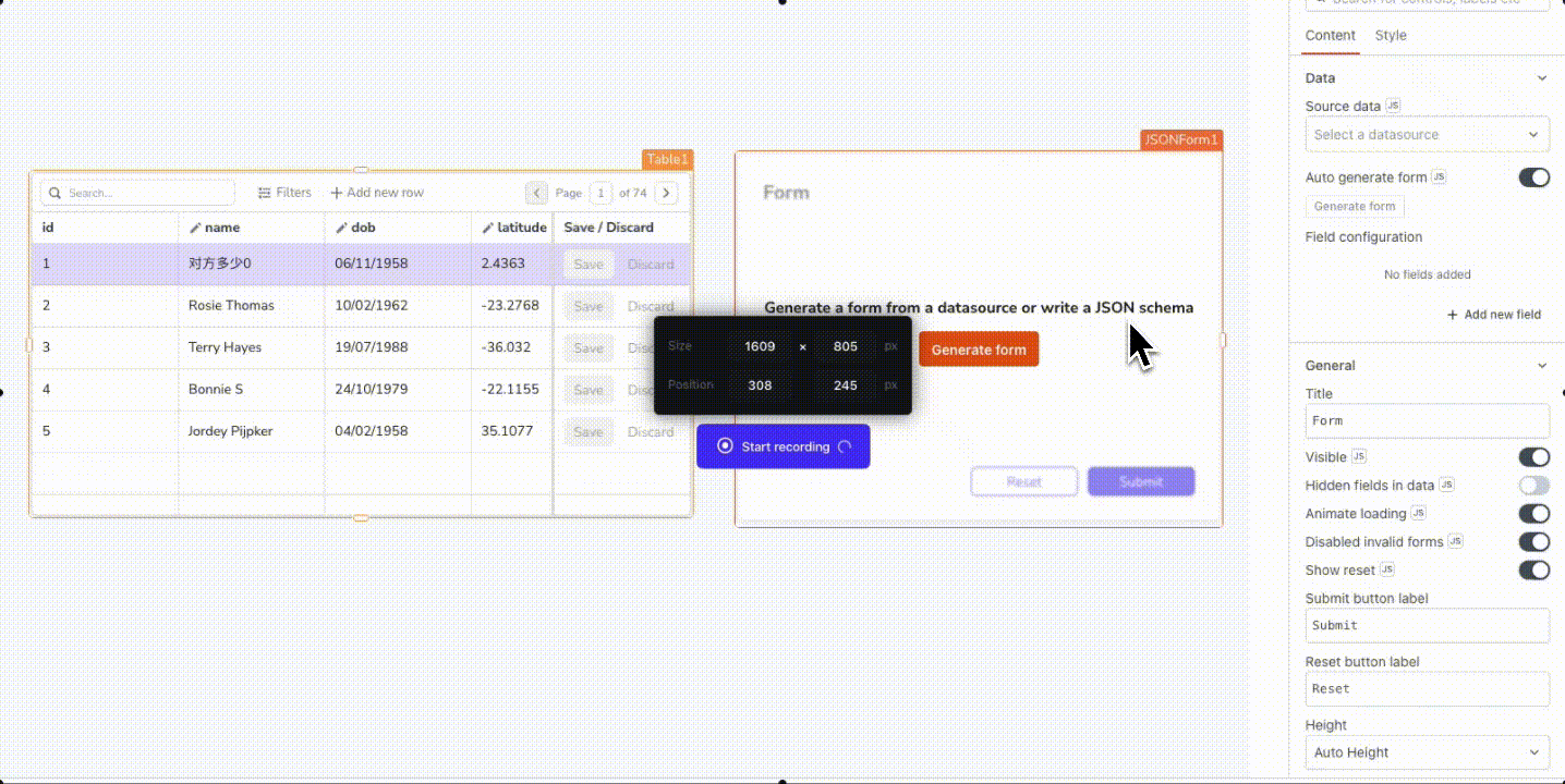
Source Data json
Connects the JSON Form to your datasource or widget, allowing you to add new records or edit existing ones. To bind data to the JSON Form, click on Generate Form and select either a datasource, query, or widget.
If you don't have a query, you can choose your datasource, select the desired table or collection, and specify the identifiable property. Appsmith automatically generates a customized JSON form for your datasource and creates an insert or update query connected to the onSubmit event.
-
Select table/collection: enables the selection of the relevant table or collection type corresponding to the datasource.
-
Form Type: specifies the type of form to be created, with two options:
- Create records
- Edit records
-
Get values from: enables the selection of the Table or List widget from which the form should retrieve its values. You can then view and edit the corresponding data in JSON Form. This option is available when the Form Type is set to Edit Records and is only applicable to Table and List widget.
-
Data Identifier: serves as an attribute for the unique identification of a datasource object. By default, it's set to the primary column of the datasource. This option is available when the Form Type is set to Edit Records.
Additionally, you can use JavaScript by clicking on JS to write bindings for the Source Data property. To populate the JSON Form with data, you need to provide the data in a structured JSON format like this:
Expected data structure:
{
  "name": "John",
  "date_of_birth": "20/02/1990",
  "age": 29,
  "employee_id": 1001
}
You can display dynamic data by binding the response from a query or a JavaScript function to the Source Data property. For instance, to display a master-detail form when a user selects a row in a Table widget, you can add the below code in the Source Data property:
Example:
{{ tbluserData.selectedRow; }}
You can click on an individual row in the Table and update data in the form fields.
Based on the JSON data provided, the JSON Form automatically identifies the appropriate field type for each value. For example, if the data contains the field age, the form sets the field type to a Number Input. Additionally, you have the flexibility to add or customize field types using the Field Configuration property.
Auto Generate Form boolean
When enabled, the form layout updates automatically when the field types inside the Source Data are changed. With this, the Field Configuration property also gets automatically updated to reflect any changes in the Source Data property.
However, it's important to note that enabling this feature overrides any custom configurations that you are providing through data transformations using JavaScript.
Generate Form string
When the Auto Generate Form property is disabled, this button becomes visible. You can use this button to manually regenerate the form layout. With this, the Field Configuration property also gets updated to reflect any changes in the Source Data property.
Field Configuration list
Contains all the generated form fields. You can rearrange the items and configure them by clicking on the ⚙️ gear icon. Alternatively, the eye icon allows you to hide specific fields.
Clicking the gear icon ⚙︎ enables you to customize each form field extensively. You can select any one of the following options from the Field Type property to update the widget type for that field on the JSON Form:
- Array
- Checkbox
- Currency Input
- Datepicker
- Email Input
- Multiselect
- Multi-line Text Input
- Number Input
- Object
- Password Input
- Phone Number Input
- Radio Group
- Select
- Switch
- Text Input
Each field type offers unique sets of customizable events and configurations. For instance, the Number Input field can have a min and max value, whereas the Select field includes the options property.
Most of the field properties are similar to those found in widget properties. To explore more about these properties, you can refer to the widget reference guide for more information.
Add New Field string
Adds a new field in the form. Fields added this way are known as custom fields and you have the flexibility to delete these fields at a later time. It's important to note that custom fields do not update the Source data property.
General
Title string
Sets the text that appears at the top of the form as a title.
Hidden Fields in Data boolean
Enabling the this option updates the output data to include information from hidden fields in the source data.
For instance, suppose you have a registration form where the Date of Birth field is hidden from users in the UI. When you enable the Hidden Fields in Data option, you can access the Date of Birth field through the formData reference property.
Visible boolean
Controls the visibility of the widget. If you turn off this property, the widget would not be visible in View Mode. Additionally, you can use JavaScript by clicking on JS next to the Visible property to conditionally control the widget's visibility.
For example, if you want to make the widget visible only when the user selects Yes from a Select widget, you can use the following JavaScript expression:
{{ Select1.selectedOptionValue === "Yes" }}
Animate Loading boolean
This property controls whether the widget is displayed with a loading animation. When enabled, the widget shows a skeletal animation during the loading process. Additionally, you can control it through JavaScript by clicking on the JS next to the property.
Disable Invalid Forms boolean
When turned on, the JSON Form widget checks the validation properties, and the Submit button is automatically disabled if there are failing checks.
Show Reset boolean
When the property is enabled, a reset button is added to the form. Clicking this button resets all fields in the form to their default values. This is useful if a user wants to start over with a new entry or if they entered the wrong information and need to clear the form.
Submit Button Label string
Sets the text for the Submit button.
Reset Button Label string
Sets the text for the Reset button.
Height string
This property determines how the widget's height adjusts to changes in its content. There are three available options:
- Fixed: Maintains a constant height for the widget, allowing you to adjust it by dragging or using the resize handle.
- Auto Height: The widget's height adjusts dynamically in response to changes in its content.
- Auto Height with limits: Same as Auto height, with a configurable option to set the minimum and maximum number of rows the widget can occupy.
Events
onSubmit
Sets an action to be executed when the user clicks the Submit button on the form.
Style properties
Style properties allow you to change the look and feel of the widget.
Color
Background Color string
Sets the background color of the widget, specified as a CSS color value. It can also be manipulated programmatically using the JavaScript functions.
Border Color String string
Sets a color for the form's border, specified as a CSS color value. It can also be manipulated programmatically using the JavaScript functions.
Border and shadow
Border Width number
Sets the width of the widget's border. Accepts number values only, in px.
Border radius string
Applies rounded corners to the outer edge of the widget. If JavaScript is enabled, you can specify valid CSS border-radius to adjust the radius of the corners.
Box Shadow string
This property adds a drop shadow effect to the frame of the widget. If JavaScript is enabled, you can specify valid CSS box-shadow values to customize the appearance of the shadow.
Button styles
Button color string
Represents the color of the button, specified as a CSS color value. The background color can also be modified programmatically using JavaScript functions.
Button variant string
Specifies the style type of the button to indicate its significance.
Options:
- Primary: Fills the button with color.
- Secondary: Adds a colored border to the button while keeping the button itself white.
- Tertiary: This option does not apply any specific styling changes to the button.
This property can be dynamically set using JavaScript by providing a string value of PRIMARY, SECONDARY, or TERTIARY.
Border radius string
Applies rounded corners to the outer edge of the widget. If JavaScript is enabled, you can specify valid CSS border-radius to adjust the radius of the corners.
Box Shadow string
This property adds a drop shadow effect to the frame of the widget. If JavaScript is enabled, you can specify valid CSS box-shadow values to customize the appearance of the shadow.
Icon string
Specifies the icon to be displayed on the button. Additionally, you can use JS to dynamically set the icon. You can refer to the documentation of blueprintjs to explore a wide range of available icons.
Position string
This property allows you to configure the Icon's placement.
Options:
- Left: Aligns the Icon to the left side of the Label.
- Right: Aligns the Icon to the right side of the Label.
Placement string
Determines the spacing between the Icon and the Label.
Options:
- Start
- Center
- Between
Reference properties
Reference properties are properties that are not available in the property pane but can be accessed using the dot operator in other widgets or JavaScript functions. They provide additional information or allow interaction with the widget programmatically. For instance, to get the visibility status, you can use JSONForm1.isVisible.
formData object
Contains a JSON object with the field names and their current values in the form.
Example:
{{ JSONForm1.object }}
fieldState object
A JSON object describing the state of each field in the form. State data includes: isDisabled, isRequired, isVisible, and isValid.
Example:
// To access the object:
{{ JSONForm1.fieldState; }}

// To get state for a particular field (e.g., "name"):
{{ JSONForm1.fieldState.name; }}
isValid boolean
Reflects whether the widget's inputs are considered Valid.
Example:
{{ JSONForm1.isValid; }}
sourceData object
Contains a JSON object of the original source data which was bound to the form.
Example:
{{ JSONForm1.sourceData; }}
Methods
Widget property setters enable you to modify the values of widget properties at runtime, eliminating the need to manually update properties in the editor.
These methods are asynchronous, and you can use the .then() block to ensure execution and sequencing of subsequent lines of code in Appsmith.
setVisibility(:boolean)
Sets the visibility of the widget.
Example:
JSONForm1.setVisibility(true);
setSourceData(:object)
Sets the data to be displayed in the widget.
Example:
JSONForm1.setSourceData(<data>)
See also
- Insert Data: Learn how to insert data into your datasource using Forms and queries.
- Update Table Data: Learn how to update Table data using JSON Form widget.
- Form: Learn how to use the Form widget.