Multi TreeSelect
This page provides information on using the Multi TreeSelect, which allows users to select single or multiple options from a tree-style hierarchical dropdown list.
Content properties
These properties are customizable options present in the property pane of the widget, allowing users to modify the widget according to their preferences.
Data
Options array<object>
The Options property allows you define the options available in the Multi TreeSelect widget. It is represented as an array of objects, where each object contains properties such as label, value, and optionally children.
Expected data structure:
[
  {
    "label": "Shoes",
    "value": "SHOES",
    "children": [
      {
        "label": "Sports Shoes",
        "value": "SPORTS_SHOES"
      },
      {
        "label": "Casual Shoes",
        "value": "CASUAL_SHOES"
      }
    ]
  },
  {
    "label": "Electronics",
    "value": "ELECTRONICS",
    "children": [
      {
        "label": "Laptops",
        "value": "LAPTOPS"
      }
    ]
  },
  {
    "label": "Clothing",
    "value": "CLOTHING"
  }
]
You can dynamically generate options by fetching data from queries or JavaScript functions and binding the response to the Options property. For example, you have a database that includes a column for product categories (type), as well as other product details such as its name and description.
You can construct a query that retrieves the relevant data and formats it to be used as options, something like:
Example:
SELECT
  type AS label,
  type AS value,
  JSON_AGG(
    JSON_BUILD_OBJECT(
      'label', (name),
      'value', (name)
    )
  ) AS children
FROM product
GROUP BY type
ORDER BY label;
In the Options property, display the data using:
{{fetchData.data}}
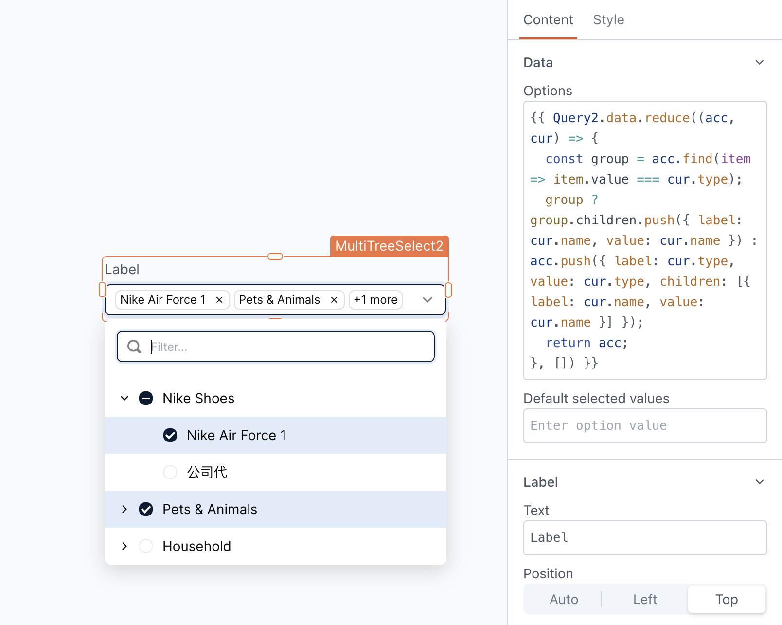
If the retrieved data is not in the desired format, you can use JavaScript to transform it before passing it to the widget. For example, you have a database that includes a column for product categories (type), as well as other product details such as its name and description. To transform this data, use:
Example:
{{ fetchData.data.reduce((acc, cur) => {
  const group = acc.find(item => item.value === cur.type);
  group ? group.children.push({ label: cur.name, value: cur.name }) : acc.push({ label: cur.type, value: cur.type, children: [{ label: cur.name, value: cur.name }] });
  return acc;
}, []) }}
Default selected values array
Allows you to specify an initial value(s) for the widget when it's first displayed. This is useful for pre-populating the widget or ensuring that specific options are selected by default.
For example, if you want the default selected values to be CLOTHING and LAPTOPS, you can set the Default Selected Values property to:
[
  "CLOTHING",
  "LAPTOPS"
]
Label
Text string
Sets the label on the widget.
Position string
This property allows you to configure the label's placement.
Options:
- Auto: Automatically positions the label based on the widget type and layout.
- Left: Aligns the label to the left side of the widget.
- Top: Positions the label above the widget.
Alignment string
This property is only available when you select Left from the Position property. It allows you to align the text to the left boundary or adjust it closer to the widget using the Right alignment option.
Width number
This property is only available when you select Left from the Position property. It allows you to control the proximity of the text to the widget, determining how close or far it can be positioned.
Validations
Required boolean
When enabled, this property makes the MultiTreeSelect a mandatory field, When the MultiTreeSelect is placed within a Form widget, enabling the Required property ensures that the Form's submit button remains disabled until the MultiTreeSelect has some value selected.
General
Tooltip string
Enables you to add hints or provide additional information to guide the user regarding the selection.
Mode string
Displays the item on the widget, there are three options:
Options:
-
Display only parent item: This option displays only the parent items, excluding any child items.
-
Display only child items: This option displays the child items. In case there are no child items, the parent item would be displayed instead.
-
Display all items: This option displays both the parent and the child items on the widget.
Placeholder string
Allows you to set the placeholder text displayed within the widget. This can be used to provide a hint or example value to the user, guiding them on the expected format or content of the input.
Visible boolean
Controls the visibility of the widget. If you turn off this property, the widget would not be visible in View Mode. Additionally, you can use JavaScript by clicking on JS next to the Visible property to conditionally control the widget's visibility.
For example, if you want to make the widget visible only when the user selects "Yes" from a Select widget, you can use the following JavaScript expression:
{{Select1.selectedOptionValue === "Yes"}}
Disabled boolean
Prevents users from selecting the widget. Even though the widget remains visible, user input is not permitted. Additionally, you can use JavaScript by clicking on JS next to the Disabled property to control the widget's disable state conditionally.
For example, if you want to allow only a specific user to fill the input, you can use the following JavaScript expression:
{{appsmith.user.email=="john@appsmith.com"?false:true}}
Animate Loading boolean
Controls whether the widget is displayed with a loading animation. When enabled, the widget shows a skeletal animation during the loading process. Additionally, you can control it through JavaScript by clicking on the JS next to the property.
Allow clearing value boolean
Enabling this option allows users to clear the selected value, whether it was the default selection or one they made themselves.
Expand all by default boolean
When enabled, this feature displays the dropdown in an expanded state by default, revealing all the available child options.
Height string
This property determines how the widget's height adjusts to changes in its content. There are three available options:
- Fixed: Maintains a constant height for the widget, allowing you to adjust it by dragging or using the resize handle.
- Auto Height: The widget's height adjusts dynamically in response to changes in its content.
- Auto Height with limits: Same as Auto height, with a configurable option to set the minimum and maximum number of rows the widget can occupy.
Events
When the event is triggered, these event handlers can execute queries, JS functions, or other supported actions.
onOptionChange
Defines the actions to be executed when the user selects or deselects an option.
onDropdownOpen
Defines the action to be performed when the user opens the dropdown.
onDropdownClose
Defines the action to be performed when the user closes the dropdown.
Style properties
Style properties allow you to change the look and feel of the widget.
Label styles
Font color string
Represents the text color of the widget, specified as a CSS color value. Additionally, the font color can be programmatically modified using JavaScript functions.
Font size string
Determines the font size of the label. It accepts CSS font-size values and can also be programmatically modified using JavaScript functions.
Emphasis string
Enables you to select a font style for the widget, such as bold or italic. Additionally, the font style can be programmatically modified using JavaScript functions.
Border and shadow
Border radius string
Applies rounded corners to the outer edge of the widget. If JavaScript is enabled, you can specify valid CSS border-radius to adjust the radius of the corners.
Box Shadow string
This property adds a drop shadow effect to the frame of the widget. If JavaScript is enabled, you can specify valid CSS box-shadow values to customize the appearance of the shadow.
Reference properties
These properties are not available in the property pane, but can be accessed using the dot operator in other widgets or JavaScript functions. For instance, to get the visibility status, you can use MultiTreeSelect1.isVisible.
options array
The options property contains the values available for selection in a Multi TreeSelect widget.
Example:
{{MultiTreeSelect1.options}}
selectedOptionLabels array
The selectedOptionLabels property represents an array of labels for the selected options. The labels updates dynamically if the default values of the dropdown change or if the user modifies their option selection.
Example:
{{MultiTreeSelect1.selectedOptionLabels}}
selectedOptionValues array
The selectedOptionValues property represents an array of values for the selected options. The values updates dynamically if the default values of the dropdown change or if the user modifies their option selection.
Example:
{{MultiTreeSelect1.selectedOptionValues}}
isDisabled boolean
The isDisabled property reflects the state of the widget's Disabled setting. It is represented by a boolean value, where true indicates that the widget is not available, and false indicates that it is enabled for user interaction.
Example:
{{MultiTreeSelect1.isDisabled}}
isVisible boolean
The isVisible property indicates the visibility state of a widget, with true indicating it is visible and false indicating it is hidden.
Example:
{{MultiTreeSelect1.isVisible}}
isValid boolean
The isValid property indicates the validation status of a widget, providing information on whether the widget's current value is considered valid or not.
Example:
{{MultiTreeSelect1.isValid}}
See also
- Insert Data – Learn how to insert data into a datasource using widgets.
- Update Data – Discover how to update data using widgets.