TreeSelect
This page explains how to use the TreeSelect widget to allow users to select a single option from a hierarchical list.
Content properties
These properties are customizable options present in the property pane of the widget, allowing users to modify the widget according to their preferences.
Data
Options array
Use to set options in the list of the TreeSelect widget. Options must be specified as an array of objects with a label and value property. The tree structure can be added to any option by adding the children field that should be an object. For example:
[
  {
    "label": "Shoes",
    "value": "SHOES",
    "children": [
      {
        "label": "Sports Shoes",
        "value": "SPORTS_SHOES"
      },
      {
        "label": "Casual Shoes",
        "value": "CASUAL_SHOES"
      }
    ]
  },
  {
    "label": "Electronics",
    "value": "ELECTRONICS",
    "children": [
      {
        "label": "Laptops",
        "value": "LAPTOPS"
      }
    ]
  },
  {
    "label": "Clothing",
    "value": "CLOTHING"
  }
]
You can dynamically generate options by fetching data from queries or JS functions by binding the response to the Options property. For example, if you have a query named fetchData, you can bind its response using:
{{fetchData.data}}
If the retrieved data is not in the desired format, you can use JavaScript to transform the data by adding it to the Options property in the TreeSelect widget. For example, you have a database that includes a column for product categories (type), as well as other product details such as its name and description. To transform this data, use:
Example:
{{ getdata.data.reduce((acc, cur) => {
  const group = acc.find(item => item.value === cur.type);
  group ? group.children.push({ label: cur.name, value: cur.name }) : acc.push({ label: cur.type, value: cur.type, children: [{ label: cur.name, value: cur.name }] });
  return acc;
}, []) }}
This code takes an array of products and creates a nested data structure that groups the products by their type, making it easier to display them in a hierarchical view.
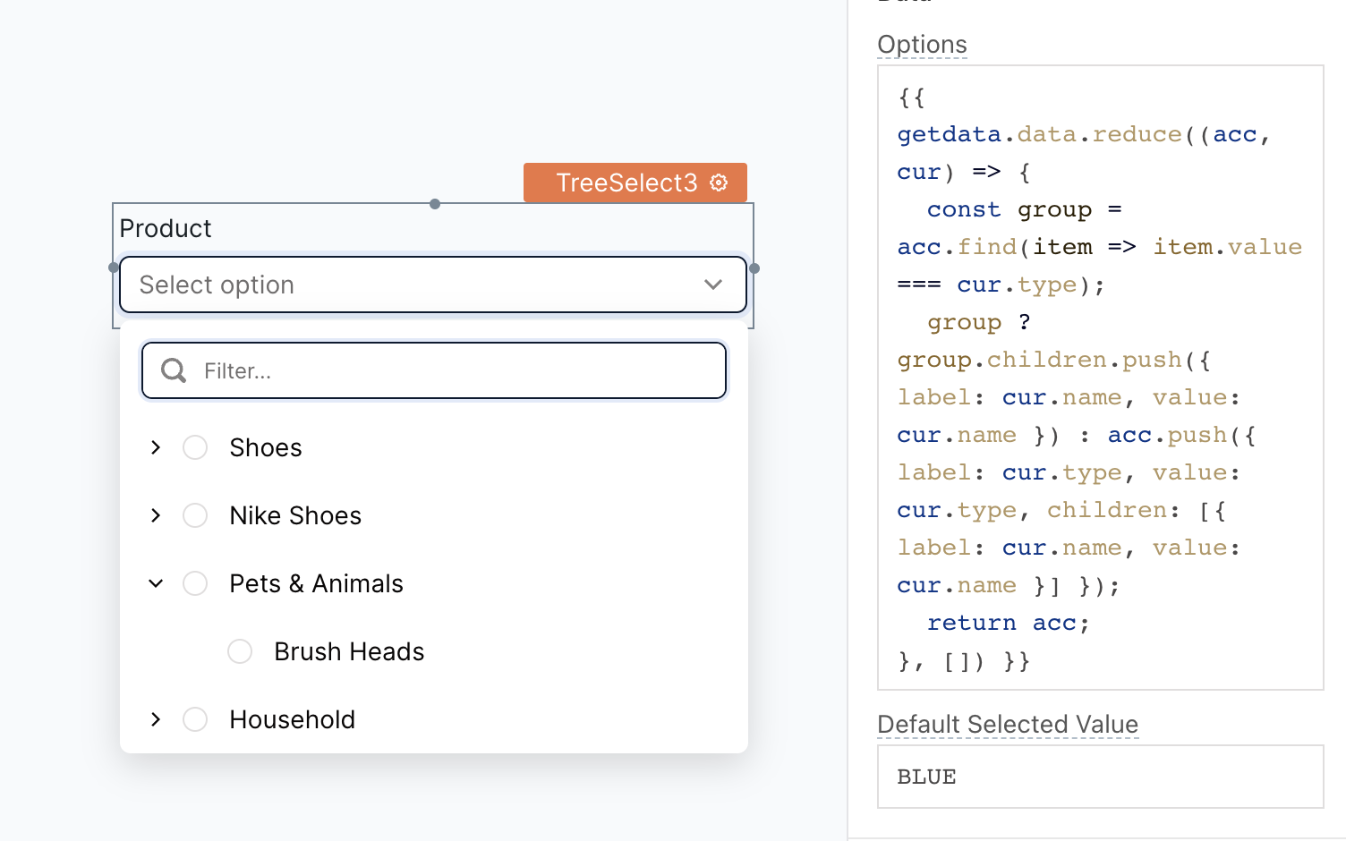
Default selected value string
Allows you to specify an initial value(s) for the widget when it's first displayed. This is useful for pre-populating the widget or ensuring that specific options are selected by default.
For example, if you want the default selected value to be CLOTHING, you can set the Default Selected Values property to:
[
  "CLOTHING"
]
Label
Text string
Sets the label of the widget.
Position string
Sets the placement of the Label in the widget.
Options:
- Left: The label is placed on the left of the widget.
- Top: The label gets placed at the top of the widget.
- Auto: The label position is determined based on the height of the widget itself.
Alignment string
Sets the label alignment of the widget when the position selected is Left.
Width (in columns) number
Sets the width of the label in the widget when the Left position is selected.
Validations
Required boolean
Enabling this property for a TreeSelect widget makes it a mandatory field, meaning that the user must select a value from the dropdown. When the select widget is placed within a Form widget and the Required property is enabled, the Form's submit button remains inactive until a value is selected in the select widget.
General
Tooltip string
Enables you to add hints or provide additional information to guide the user regarding the selection.
Placeholder string
Allows you to set the placeholder text displayed within the widget. This can be used to provide a hint or example value to the user, guiding them on the expected format or content of the input.
Visible boolean
Controls the visibility of the widget. If you turn off this property, the widget would not be visible in View Mode. Additionally, you can use JavaScript by clicking on JS next to the Visible property to conditionally control the widget's visibility.
For example, if you want to make the widget visible only when the user selects "Yes" from a Select widget, you can use the following JavaScript expression:
{{Select1.selectedOptionValue === "Yes"}}
Disabled boolean
Prevents users from selecting the widget. Even though the widget remains visible, user input is not permitted. Additionally, you can use JavaScript by clicking on JS next to the Disabled property to control the widget's disable state conditionally.
For example, if you want to allow only a specific user to fill the input, you can use the following JavaScript expression:
{{appsmith.user.email=="john@appsmith.com"?false:true}}
Animate Loading boolean
Controls whether the widget is displayed with a loading animation. When enabled, the widget shows a skeletal animation during the loading process. Additionally, you can control it through JavaScript by clicking on the JS next to the property.
Allow clearing value boolean
Enabling this option allows users to clear the selected value, whether it was the default selection or one they made themselves.
Expand all by default boolean
When enabled, this feature displays the dropdown in an expanded state by default, revealing all the available child options.
Height string
This property determines how the widget's height adjusts to changes in its content.
Options:
- Fixed: Maintains a constant height for the widget, allowing you to adjust it by dragging or using the resize handle.
- Auto Height: The widget's height adjusts dynamically in response to changes in its content.
- Auto Height with limits: Same as Auto height, with a configurable option to set the minimum and maximum number of rows the widget can occupy.
Events
onOptionChange
Allows you to configure one or multiple actions (Framework functions, queries, or JS functions) to be executed when the user selects an option in the dropdown list. It enables you to capture the user's input and perform specific actions in response. You can also write custom JavaScript logic for this event by clicking on the JS button next to the property.
onDropdownOpen
Allows you to configure one or multiple actions (Framework functions, queries, or JS functions) to be executed when the user opens the dropdown list. For example, you could use the onDropdownOpen event to retrieve data from a database, populate the options in the dropdown list, or display additional information to the user. You can also write custom JavaScript logic for this event by clicking on the JS button next to the property.
onDropdownClose
Allows you to configure one or multiple actions (Framework functions, queries, or JS functions) to be executed when the user closes the dropdown list. For example, you could use the onDropdownClose event to store the selected option in a database, hide additional information, or reset the widget to its original state. You can also write custom JavaScript logic for this event by clicking on the JS button next to the property.
Style properties
Style properties allow you to change the look and feel of the widget.
Label styles
Font color string
Represents the text color of the widget, specified as a CSS color value. You can also click the JS button to programmatically modify the font color using JavaScript functions.
Font size string
Determines the font size of the label. It accepts CSS font-size values. You can also click the JS button to programmatically modify the font size using JavaScript functions.
Emphasis string
Enables you to select a font style for the widget, such as bold or italic. You can click the JS button to programmatically modify the font style using JavaScript functions.
Border and shadow
Border radius string
Applies rounded corners to the outer edge of the widget. To control the border radius programmatically, click the JS button to enable JavaScript and specify a valid CSS border-radius to adjust the radius of the corners.
Box Shadow string
This property adds a drop shadow effect to the frame of the widget. To control the Box Shadow programmatically, click the JS button to enable JavaScript and specify a valid CSS box-shadow values to customize the appearance of the shadow.
Reference properties
Reference properties enable you to access the widget's data and state using the dot operator in other widgets or JavaScript functions. They provide additional information or allow interaction with the widget programmatically. For instance, to retrieve the visibility status of a select widget, you can use treeSelect1.isVisible.
options array
The options property contains the values available for selection in a TreeSelect widget.
Example:
{{TreeSelect1.options}}
selectedOptionLabel string
Returns the label of the option selected in the TreeSelect widget. It changes if the default value of the widget changes or the user selects an option.
Example:
{{TreeSelect1.selectedOptionLabel}}
selectedOptionValue string
Returns the value of the option selected in the TreeSelect widget. It changes if the default value of the widget changes or the user selects an option.
Example:
{{TreeSelect1.selectedOptionValue}}
isDisabled boolean
The isDisabled property reflects the state of the widget's Disabled setting. It is represented by a boolean value, where true indicates that the widget is not available, and false indicates that it is enabled for user interaction.
Example:
{{TreeSelect1.isDisabled}}
isVisible boolean
The isVisible property indicates the visibility state of a widget, with true indicating it is visible and false indicating it is hidden.
Example:
{{TreeSelect1.isVisible}}
isValid boolean
The isValid property indicates the validation status of a widget, providing information on whether the widget's current value is considered valid or not.
Example:
{{TreeSelect1.isValid}}
Methods
Widget property setters enable you to modify the values of widget properties at runtime, eliminating the need to manually update properties in the editor.
These methods are asynchronous and return a Promise. You can use the .then() block to ensure execution and sequencing of subsequent lines of code in Appsmith.
setDisabled (param: boolean): Promise
Sets the disabled state of the widget.
Example:
TreeSelect1.setDisabled(false)
setRequired (param: boolean): Promise
Sets whether the widget is required or not.
Example:
TreeSelect1.setRequired(true)
See also
- Insert Data – Learn how to insert data into a datasource using widgets.
- Update Data – Discover how to update data using widgets.