Range Slider
This page describes the properties of the Range Slider, which allows users to select a range of values within a specified minimum and maximum range.
Content properties
These properties are customizable options present in the property pane of the widget, allowing users to modify the widget according to their preferences.
Data
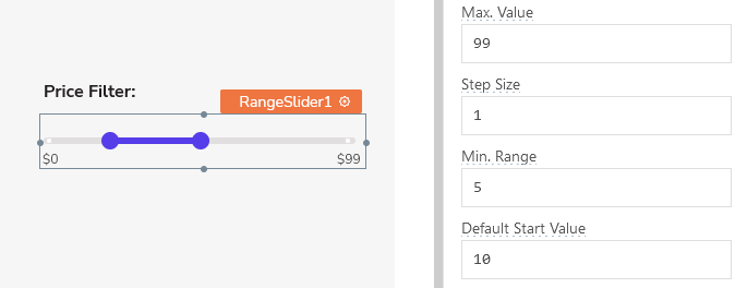
Min Value number
Indicates the lowest possible value that the slider can start from. The value can include negative numbers and decimals, but it should always be smaller than the Maximum Value.
Max Value number
Indicates the highest possible value for the slider. The value can encompass negative numbers and decimals, but it must always surpass the Minimum Value.
Step Size number
Denotes the amount by which the user can modify the slider's value. This value must be at least 0.1 and less than or equal to Min. Range.
Min. Range number
The smallest permissible interval between the selected values. This value must be greater than or equal to Step Size.
Default Start Value number
Defines a starting value for the range, which serves as the initial point unless modified by the user. This numeric value should fall within the range of the Min Value and Max Value, and it should be lower than the Default End Value.
Default End Value number
Defines a ending value for the range, which serves as the end point unless modified by the user. This numeric value should fall within the range of the Min Value and Max Value, and it should be higher than the Default Start Value.
Label
Text string
Sets the label on the widget.
Position string
This property allows you to configure the label's placement.
Options:
- Auto: Automatically positions the label based on the widget type and layout.
- Left: Aligns the label to the left side of the widget.
- Top: Positions the label above the widget.
Alignment string
This property is only available when you select Left from the Position property. It allows you to align the text to the left boundary or adjust it closer to the widget using the Right alignment option.
Width (in columns) number
This property is only available when you select Left from the Position property. It allows you to control the proximity of the text to the widget, determining how close or far it can be positioned.
General
Tooltip string
Enables you to add hints or provide additional information to guide the user regarding the required input.
Show Marks boolean
When enabled, this property displays the labels below the slider element within the widget.
Marks array<object>
Sets the label and corresponding values for the marks located below the slider.
Expected data structure:
[
  {
    "value": 25,
    "label": "25%"
  },
  {
    "value": 50,
    "label": "50%"
  },
  {
    "value": 75,
    "label": "75%"
  }
]
Additionally, you can display dynamic data from queries or JS functions by binding the response to the Marks property. For example, if you have a query named fetchData, you can bind its response using:
Example:
{{fetchData.data}}
If the query data is not in the expected format, you can use the map() function to transform it before passing it to the widget, like:
Example:
{{fetchData.data.map( p => ({label: p.size, value: p.size}))}}
Visible boolean
Controls the visibility of the widget. If you turn off this property, the widget would not be visible in View Mode. Additionally, you can use JavaScript by clicking on JS next to the Visible property to conditionally control the widget's visibility.
For example, if you want to make the widget visible only when the user selects "Yes" from a Select widget, you can use the following JavaScript expression:
{{Select1.selectedOptionValue === "Yes"}}
Disabled boolean
Prevents users from selecting the widget. Even though the widget remains visible, user input is not permitted. Additionally, you can use JavaScript by clicking on JS next to the Disabled property to control the widget's disable state conditionally.
For example, if you want to allow only a specific user to fill the input, you can use the following JavaScript expression:
{{appsmith.user.email=="john@appsmith.com"?false:true}}
Animate Loading boolean
Controls whether the widget is displayed with a loading animation. When enabled, the widget shows a skeletal animation during the loading process. Additionally, you can control it through JavaScript by clicking on the JS next to the property.
Show value always boolean
Maintains the constant visibility of a tooltip containing the current value.
Events
When the event is triggered, these event handlers can execute queries, JS functions, or other supported actions.
onStartValueChange
Specifies one or multiple actions to be triggered when the user changes the start value of the Range Slider.
onEndValueChange
Specifies one or multiple actions to be triggered when the user changes the end value of the Range Slider.
Style properties
Style properties allow you to change the look and feel of the widget.
General
Size string
Defines the size of the slider.
Options:
- Small
- Medium
- Large
Label styles
Font color string
Represents the text color of the widget, specified as a CSS color value. Additionally, the font color can be programmatically modified using JavaScript functions.
Font size string
Determines the font size of the label. It accepts CSS font-size values and can also be programmatically modified using JavaScript functions.
Emphasis string
Enables you to select a font style for the widget, such as bold or italic. Additionally, the font style can be programmatically modified using JavaScript functions.
Color
Fill color string
Represents the color of the slider, specified as a CSS color value. The slider color can also be modified programmatically using JavaScript functions.
Reference properties
Reference properties are properties that are not available in the property pane but can be accessed using the dot operator in other widgets or JavaScript functions. They provide additional information or allow interaction with the widget programmatically. For instance, to get the visibility status, you can use RangeSlider1.isVisible.
start number
Enables you to retrieve the start value that has been selected with the slider.
Example:
{{RangeSlider1.start}}
start number
Enables you to retrieve the end value that has been selected with the slider.
Example:
{{RangeSlider1.end}}
isVisible boolean
The isVisible property indicates the visibility state of a widget, with true indicating it is visible and false indicating it is hidden.
Example:
{{RangeSlider1.isVisible}}
Methods
Widget property setters enable you to modify the values of widget properties at runtime, eliminating the need to manually update properties in the editor.
These methods are asynchronous and return a Promise. You can use the .then() block to ensure execution and sequencing of subsequent lines of code in Appsmith.
setDisabled (param: boolean): Promise
Sets the disabled state of the widget.
Example:
RangeSlider1.setDisabled(false)
setVisibility (param: boolean): Promise
Sets the visibility of the widget.
Example:
RangeSlider1.setVisibility(true)
See also
- Insert Data – Learn how to insert data into a datasource using widgets.
- Update Data – Discover how to update data using widgets.
- Form – Learn more about the Form widget.
- Create a Multi-step Wizard – See how to create a multi-step form.