Card
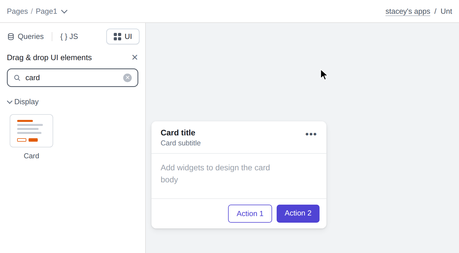
This page provides information on using the Card widget, which groups related information and actions into a visually distinct unit. A Card is made up of four zones: an optional media slot for an image, a header with an avatar, title, subtitle, badge, and overflow (⋮) menu, a body canvas where you can drop other widgets to design the card's content, and a footer with action buttons. Cards can also be made clickable, selectable, and collapsible.
Content properties
These properties are customizable options present in the property pane of the widget, allowing users to modify the widget according to their preferences.
Data
Card data object
Sets the entity displayed by the card. You can connect a datasource using the Connect data button, or bind a single record, which is an object with one or more keys, using JavaScript:
{{userQuery.data[0]}}
When you connect a datasource, Appsmith generates a query, binds the first record to Card data, and creates bindings for the Title and Subtitle properties based on the fields you map. The bound record is available anywhere in the app through the cardData reference property, so widgets placed inside the card body can display its fields, for example:
{{Card1.cardData.email}}
Media
Position string
Sets the position of the media slot. When set to a value other than None, the image set in the Image property is displayed in the media slot.
Options:
- Top: Displays the image above the header, spanning the full width of the card.
- Left: Displays the image along the left edge of the card.
- None: Hides the media slot. This is the default.
Image string
Sets the image to display in the media slot, as a URL or a Base64-encoded image. The image is shown only when Position is not None.
Alt text string
Sets the alternative text of the media image for screen readers. This property is available only when Position is not None.
Media height number
Sets the height of the media slot in pixels. The minimum value is 40, and the default is 140. This property is available only when Position is set to Top.
Image fit string
Sets how the image fits inside the media slot. This property is available only when Position is not None.
Options:
- Cover: Scales the image to fill the media slot, cropping it if necessary. This is the default.
- Contain: Scales the image to fit entirely inside the media slot, which may leave empty space around it.
Header
Show header boolean
Controls the visibility of the card header. When turned off, the title, subtitle, avatar, badge, and overflow menu are hidden. Additionally, you can use JavaScript by clicking on JS next to the property to control it conditionally.
Title string
Sets the title displayed in the card header. You can bind it to a field of the connected record, for example:
{{Card1.cardData.name}}
Subtitle string
Sets the subtitle displayed below the title in the card header.
Avatar image string
Sets the avatar image displayed at the left of the card header, as a URL or a Base64-encoded image. When set, it takes precedence over the Avatar icon property.
Avatar icon string
Sets the avatar icon displayed at the left of the card header. The icon is used only when no Avatar image is set.
Badge text string
Sets the text of the status badge displayed in the card header, such as Active or Pending. When empty, no badge is shown.
Badge color string
Sets the background color of the status badge. If JavaScript is enabled, you can specify a valid CSS color value.
Show menu boolean
Controls the visibility of the overflow (⋮) menu in the card header. Turning this off removes the menu entirely.
Menu items
Configures the items of the overflow (⋮) menu. Each menu item opens a panel with the following properties:
- Label: Sets the label of the menu item.
- onClick: Sets the action to run when the menu item is clicked.
- Visible: Controls the visibility of the menu item.
- Disabled: Disables the menu item.
- Icon, Position: Set an icon for the menu item and its alignment.
- Icon color, Text color: Set the colors of the menu item's icon and text.
Footer
Show footer boolean
Controls the visibility of the card footer, which contains the action buttons.
Actions
Configures the action buttons rendered in the card footer. By default, a card has a secondary Action 1 button and a primary Action 2 button. Each action opens a panel with the following properties:
- Label: Sets the label of the action button.
- onClick: Sets the action to run when the button is clicked.
- Visible: Controls the visibility of the button. Hiding all actions removes the footer.
- Disabled: Disables the button.
- Button variant: Sets the button style, which can be Primary, Secondary, or Tertiary.
- Icon, Position: Set an icon for the button and its alignment.
- Button color: Sets the color of the button. By default, it follows the app theme's primary color.
Selection
Enable selection boolean
Lets users select the card by clicking it. When selection is enabled, clicking the card toggles its selection state and highlights it with the Selected accent color. Selection takes precedence over the Clickable behavior: while selection is enabled, clicking the card toggles selection instead of firing the onCardClick event.
The current selection state is available through the isSelected reference property.
Default selected boolean
Selects the card by default. Changing this value updates the card's selection state. This property is available only when Enable selection is turned on.
onSelect
Specifies the action to run when the card selection is toggled. The new state is available on the card's isSelected property.
Expansion
Enable expand and collapse boolean
Shows a chevron in the card header that lets users collapse the card down to its media and header, hiding the body and footer. The current state is available through the isExpanded reference property.
Default expanded boolean
Expands the card by default. Changing this value updates the card's expansion state. This property is available only when Enable expand and collapse is turned on.
onExpand
Specifies the action to run when the card is expanded.
onCollapse
Specifies the action to run when the card is collapsed.
General
Visible boolean
Controls the visibility of the widget. If you turn off this property, the widget is not visible in View mode. Additionally, you can use JavaScript by clicking on JS next to the Visible property to control the widget's visibility conditionally.
For example, if you want to make the widget visible only when the user checks an item in a Checkbox widget, you can use the following JavaScript expression:
{{Checkbox1.isChecked}}
Clickable boolean
Makes the whole card clickable and enables the onCardClick event. When Enable selection is turned on, clicking the card toggles selection instead of firing onCardClick.
Disabled boolean
Disables the card: it is dimmed, and card clicks, selection, expansion, footer actions, and the overflow menu are all blocked. Additionally, you can use JavaScript by clicking on JS next to the property to control it conditionally.
Scroll contents boolean
Enables scrolling for content inside the card body when it does not fit the card's height.
Animate loading boolean
Controls whether the widget is displayed with a loading animation. When enabled, the widget shows a skeletal animation during the loading process. Additionally, you can control it through JavaScript by clicking on the JS next to the property.
Height string
This property determines how the widget's height adjusts to changes in its content. There are three available options:
- Fixed: The height of the widget remains as set using drag and resize.
- Auto Height: The widget's height adjusts dynamically in response to changes in its content.
- Auto Height with limits: Same as Auto height, with a configurable option to set the minimum and maximum number of rows the widget can occupy.
Events
onCardClick
Specifies the action to run when the card background is clicked. This event is available only when Clickable is turned on and Enable selection is turned off. While selection is enabled, clicking the card toggles selection instead.
Style properties
Style properties allow you to change the look and feel of the widget.
Color
Background color string
Sets the background color of the widget. If JavaScript is enabled, you can specify a valid CSS color value to adjust the background color.
Border color string
Sets the border color of the widget. If JavaScript is enabled, you can specify a valid CSS color value to adjust the border color.
Selected accent color string
Sets the accent border color shown when the card is selected. By default, it follows the app theme's primary color. This property is available only when Enable selection is turned on.
Dividers and elevation
Header divider boolean
Shows a divider between the header and the card body.
Footer divider boolean
Shows a divider between the card body and the footer.
Hover elevation boolean
Lifts the card with a stronger shadow when users hover over it.
Border and shadow
Border width string
Sets the width of the widget's border.
Border radius string
Applies rounded corners to the outer edge of the widget. If JavaScript is enabled, you can specify valid CSS border-radius to adjust the radius of the corners.
Box shadow string
This property adds a drop shadow effect to the frame of the widget. If JavaScript is enabled, you can specify valid CSS box-shadow values to customize the appearance of the shadow.
Reference properties
Reference properties enable you to access the widget's data and state using the dot operator in other widgets or JavaScript functions. They provide additional information or allow interaction with the widget programmatically. For instance, to retrieve the selection state of a Card widget, you can use Card1.isSelected.
cardData object
Contains the record bound to the card through the Card data property.
Example:
{{Card1.cardData.email}}
isSelected boolean
Indicates whether the card is currently selected, with true indicating it is selected.
Example:
{{Card1.isSelected}}
isExpanded boolean
Indicates whether the card is currently expanded, with true indicating it is expanded.
Example:
{{Card1.isExpanded}}
isVisible boolean
The isVisible property indicates the visibility state of a widget, with true indicating it is visible and false indicating it is hidden.
Example:
{{Card1.isVisible}}
isDisabled boolean
Indicates whether the card is disabled, with true indicating it is disabled.
Example:
{{Card1.isDisabled}}
Methods
Widget property setters enable you to modify the values of widget properties at runtime, eliminating the need to manually update properties in the editor.
These methods are asynchronous and return a Promise. You can use the .then() block to ensure the execution and sequencing of subsequent lines of code in Appsmith.
setVisibility (param: boolean): Promise
Sets the visibility of the widget.
Example:
Card1.setVisibility(true)
setDisabled (param: boolean): Promise
Sets the disabled state of the widget.
Example:
Card1.setDisabled(false)
setSelected (param: boolean): Promise
Sets the selection state of the card.
Example:
Card1.setSelected(true)
setExpanded (param: boolean): Promise
Expands or collapses the card.
Example:
Card1.setExpanded(false)