Custom styling (ALPHA)
Responsive Widgets are in alpha and available by invitation only on Business and Enterprise plans. Behavior and properties may change. To request access, open a support ticket and name the feature Responsive Widgets (ALPHA).
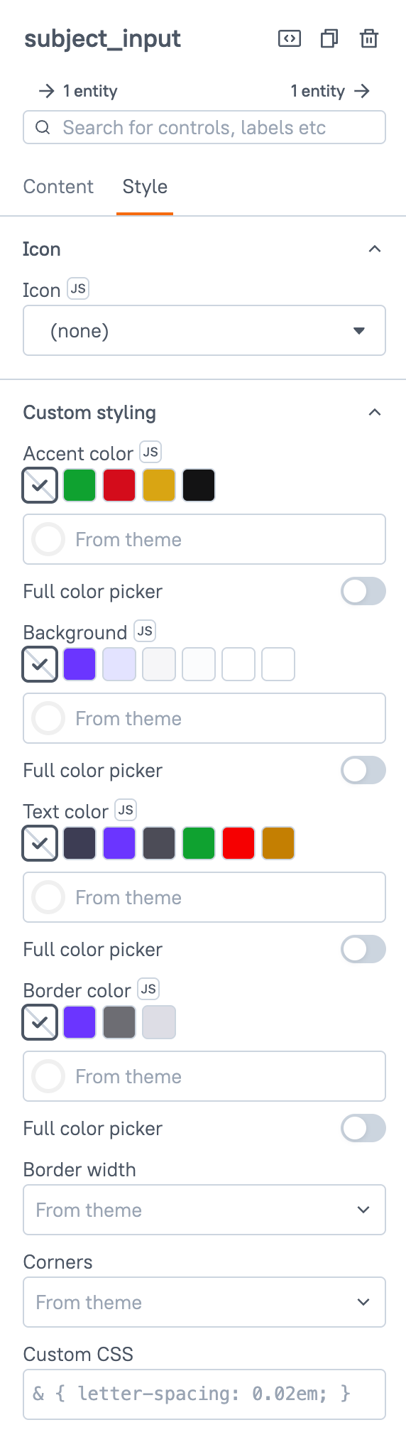
Every Responsive Widget except Custom has a Custom styling section. Use it to change the colors, border, and corners of one widget without changing the app theme. Most widgets also have a Custom CSS setting in this section. Classic widgets in fixed-layout apps do not have this section.
The section is the last one in the Style tab of the property pane. It starts collapsed when the widget has other style sections. When it is the only style section, it starts open.
Each widget has only the settings that fit it. The settings change one part of the widget, called the styled part. For example, on an Input they change the input field box, and on a Chart they change the outer card, not the chart. See Settings by widget.
How values work
- Empty means From theme. Every setting starts empty. An empty setting shows the theme value, and changes when the theme changes.
- Theme color or custom color. A color setting offers theme color swatches and a color picker. A theme color follows the theme, in light and dark mode. A custom color is fixed. It does not change in dark mode. Accent color is the exception: the widget rebuilds its colors from a custom accent for light and for dark mode.
- Some settings take a custom color only. These settings do not offer theme colors: Background on Section and Stats, Border color on Stats, and Text color on Paragraph and Heading.
- Invalid values are ignored. A value that is not a valid color shows the theme value instead. The property pane shows an error for it.
You can bind the color settings with JavaScript, so an app can pick a color at run time. Border width, Corners, and Custom CSS cannot be bound.
In code, write a theme color as token: plus its value for code, for example token:positive for Accent color or token:elevation-1 for Background. Each setting accepts only its own values. The value must match exactly, in lowercase:
| Setting | Swatch | Value for code |
|---|---|---|
| Accent color | Positive, Negative, Warning, Neutral | token:positive, token:negative, token:warning, token:neutral |
| Background | Accent, Accent, subtle, Neutral, subtle | token:accent, token:accent-subtle, token:neutral-subtle |
| Background | Surface 1, Surface 2, Surface 3 | token:elevation-1, token:elevation-2, token:elevation-3 |
| Text color | Default, Accent, Neutral, Positive, Negative, Warning | token:default, token:accent, token:neutral, token:positive, token:negative, token:warning |
| Border color, Line color | Accent, Neutral, Surface | token:accent, token:neutral, token:elevation-1 |
A custom color can be a hex value (#553de9), rgb(), rgba(), hsl(), hsla(), hsv(), hsva(), a color name, or transparent. URLs, CSS variables, and keywords such as inherit or currentColor are not valid.
Settings
Accent color string
Builds the hover, pressed, focus, and text colors of the widget from one color, in light and dark mode. Lists and menus that the widget opens use them too.
When Accent color is empty, the widget uses the Accent color of the nearest container around it that has one, such as a Section, Zone, Card, or Modal. Without such a container, it uses the theme accent. A container's Accent color also changes the Accent and Accent, subtle background swatches of the widgets inside it.
Theme colors: Positive, Negative, Warning, Neutral.
On a widget with its own color setting, such as Button color on a Button, Accent color shows only while that setting is Accent.
The focus ring uses the accent color. When the ring has less than 3:1 contrast with the background behind it, it gets a 2px black or white outer ring, whichever stands out more.
- The background behind the ring is the Background of the nearest container that sets one, such as a Card, Zone, or Section, or else the theme background. A gradient or see-through background is skipped, and the next one above is used.
- The check runs on a widget with its own Accent color, on a container with its own Background and the widgets inside it, and inside a Modal or Sheet.
- Other widgets keep their usual focus ring. Fixed-layout apps are unchanged.
Background string
Sets the background of the styled part.
Theme colors: Accent, Accent, subtle, Neutral, subtle, Surface 1, Surface 2, Surface 3. On a widget that also has Text color, each theme background comes with a theme text color that is readable on it.
On Section, Stats, Zone, Card, Modal, and Sheet, Background also takes a gradient. Choose Gradient in the color control to build one:
- Set the angle, or pick one of the preset angles: 0°, 90°, 180°, or 270°.
- Click Add stop to add a stop, up to 6. A gradient needs at least 2 stops. Each stop has a color and a position, in percent.
- A gradient typed by hand, such as
linear-gradient(135deg, #6366f1, #8b5cf6), goes through the JS button.linear-gradient(),radial-gradient(),conic-gradient(), and theirrepeating-forms are accepted, up to 1024 characters. - Solid turns the gradient into a solid color.
A gradient does not change in dark mode, and it sets no text color. Check that the text is readable in light and dark mode.
On a Modal or Sheet, Background changes the dialog surface. The dimmed overlay behind the dialog does not change.
Text color string
Sets the text color of the styled part.
Theme colors: Default, Accent, Neutral, Positive, Negative, Warning.
When Text color is empty and Background is set, the widget picks a text color that is readable on the background.
When the text color and the background have a contrast below 4.5:1, the property pane shows this warning under Text color:
Low contrast: <ratio>:1. Text needs at least 4.5:1 against the background.
- The warning shows only on widgets that also have a Background setting.
- Both values must be solid colors with no transparency. An empty Text color, a binding, a gradient, or a see-through color gives no warning.
- A theme color is measured with the theme colors of the current mode. When one color follows the theme and the other is a custom color, the pane shows
One color follows the theme and one is fixed. Check light and dark mode., whatever the contrast.
Border color string
Sets the border color of the styled part. A color with no Border width draws a thin border.
Theme colors: Accent, Neutral, Surface.
On a Divider, this setting is called Line color and sets the color of the line. The Divider's own Thickness setting sets the line width.
Border width string
Sets the border width of the styled part. Options: From theme (default), None, Thin, Medium, Thick.
Corners string
Sets the corner radius of the styled part. Options: From theme (default), Sharp, Rounded, Pill. These are the same options as Corners in the app theme.
Custom CSS string
Adds CSS that applies to this widget only. See Custom CSS.
Settings by widget
This table lists the settings each widget has, and the part of the widget they change.
- Yes, or gradient: the setting also takes a gradient.
- Custom color only: the setting does not offer theme colors.
- Box around the widget: the widget has Custom CSS, and
&is the box around the widget, not the styled part. On every other widget with Custom CSS,&is the styled part. - —: the widget does not have the setting.
| Widget | Accent color | Background | Text color | Border | Corners | Custom CSS | Styled part |
|---|---|---|---|---|---|---|---|
| Avatar | Yes | — | — | — | — | Box around the widget | Control |
| Badge | Yes | — | — | — | — | Box around the widget | Control |
| Button | Yes | — | — | — | — | Box around the widget | Control |
| Card | Yes | Yes, or gradient | Yes | Yes | Yes | Yes | Surface |
| Carousel | Yes | Yes | Yes | Yes | Yes | Yes | Surface |
| Chart | — | Yes | — | Yes | Yes | Yes | Outer card |
| Chat | Yes | — | — | — | — | Yes | Whole widget |
| Checkbox | Yes | — | — | — | — | Box around the widget | Control |
| Checkbox Group | Yes | — | — | — | — | Box around the widget | Control |
| Chip Group | Yes | — | — | — | — | Box around the widget | Control |
| Code | — | — | — | — | — | Yes | Whole widget |
| Code Scanner | — | Yes | — | Yes | Yes | Yes | Outer card |
| ColorPicker | Yes | Yes | Yes | Yes | Yes | Box around the widget | Input field box |
| ComboBox | Yes | Yes | Yes | Yes | Yes | — | Input field box |
| Currency Input | Yes | Yes | Yes | Yes | Yes | Box around the widget | Input field box |
| Custom | — | — | — | — | — | — | None |
| DatePicker | Yes | Yes | Yes | Yes | Yes | Box around the widget | Input field box |
| DateRangePicker | Yes | Yes | Yes | Yes | Yes | Box around the widget | Input field box |
| Divider | — | — | — | Line color | — | Yes | Line |
| Email Input | Yes | Yes | Yes | Yes | Yes | Box around the widget | Input field box |
| Embed | — | — | — | — | — | Yes | Whole widget |
| FAB | Yes | — | — | — | — | — | Control |
| File Upload | Yes | — | — | — | — | Yes | Whole widget |
| Heading | — | — | Custom color only | — | — | Yes | Text |
| Icon Button | Yes | — | — | — | — | Box around the widget | Control |
| Image | — | — | — | Yes | Yes | Yes | Image frame |
| Inline Buttons | Yes | — | — | — | — | — | Control |
| Input | Yes | Yes | Yes | Yes | Yes | Box around the widget | Input field box |
| KeyValue | Yes | — | — | — | — | Yes | Whole widget |
| Link | Yes | — | — | — | — | Box around the widget | Control |
| List | Yes | Yes | Yes | Yes | Yes | Yes | Surface |
| Map Chart | — | Yes | — | Yes | Yes | Yes | Outer card |
| Markdown | — | — | Yes | — | — | Yes | Text |
| Media | — | Yes | — | Yes | Yes | Yes | Outer card |
| Menu Button | Yes | — | — | — | — | Box around the widget | Control |
| Modal | Yes | Yes, or gradient | Yes | Yes | Yes | Yes | Dialog surface |
| Multiline Input | Yes | Yes | Yes | Yes | Yes | Box around the widget | Input field box |
| MultiSelect | Yes | Yes | Yes | Yes | Yes | Box around the widget | Input field box |
| Number Input | Yes | Yes | Yes | Yes | Yes | Box around the widget | Input field box |
| Paragraph | — | — | Custom color only | — | — | Yes | Text |
| Password Input | Yes | Yes | Yes | Yes | Yes | Box around the widget | Input field box |
| Phone Input | Yes | Yes | Yes | Yes | Yes | Box around the widget | Input field box |
| Progress | Yes | — | — | — | — | Box around the widget | Control |
| Radio Group | Yes | — | — | — | — | Box around the widget | Control |
| Rating | Yes | — | — | — | — | Box around the widget | Control |
| Rich Text Editor | Yes | — | — | — | — | Yes | Whole widget |
| Search | Yes | Yes | Yes | Yes | Yes | Box around the widget | Input field box |
| Section | Yes | Custom color or gradient | Yes | Yes | Yes | Yes | Surface |
| Select | Yes | Yes | Yes | Yes | Yes | — | Input field box |
| Sheet | Yes | Yes, or gradient | Yes | Yes | Yes | Yes | Dialog surface |
| Signature | — | — | — | — | — | Yes | Whole widget |
| Slider | Yes | — | — | — | — | Box around the widget | Control |
| Stats | Yes | Custom color or gradient | Yes | Custom color only | Yes | Yes | Surface |
| Switch | Yes | — | — | — | — | Box around the widget | Control |
| Switch Group | Yes | — | — | — | — | Box around the widget | Control |
| Table | Yes | — | — | — | — | Yes | Whole widget |
| Tabs | Yes | Yes | Yes | Yes | Yes | Yes | Surface |
| TagGroup | Yes | — | — | — | — | Box around the widget | Control |
| Text List | Yes | Yes | Yes | Yes | Yes | Yes | Surface |
| Toolbar Buttons | Yes | — | — | — | — | — | Control |
| Tree | Yes | — | — | — | — | Yes | Whole widget |
| Tree Select | Yes | Yes | Yes | Yes | Yes | Box around the widget | Input field box |
| Zone | Yes | Yes, or gradient | Yes | Yes | Yes | Yes | Surface |
Two widget types have no page of their own. WDS_TABLE_WIDGET has the same settings as Table, but its custom CSS works as on other widgets, without the .anvil-table__* class names. WDS_AI_CHAT_WIDGET has the same settings as Chat.
Custom CSS
Custom CSS adds your own CSS to one widget. It is the last setting in the Custom styling section. Toolbar Buttons, Inline Buttons, FAB, Select, ComboBox, and Custom do not have it. Each of their pages says why.
- Plain CSS only. You cannot bind it. CSS that contains
{{is ignored as a whole. - Rules apply only inside the widget. Appsmith places every selector inside the widget, so a rule cannot style another widget or the page.
- What
&is. On most widgets,&is the styled part. On a control or a field, such as a Button or an Input,&is the box around the widget, its label included, not the part inside it. To style an inner part, use its element selector, for examplebuttonorinput. On the Table,&is the table. On a Card,&is the card surface. On a Modal or Sheet,&is the dialog surface. - The widget keeps its box. Custom CSS can paint up to 8px past the widget box, which leaves room for focus rings and small shadows. Anything beyond that is clipped. A
z-indexabove 10 is lowered to 10, and it applies only inside the widget. - Size limit. CSS longer than 20 KB (20,480 characters) is ignored as a whole.
Example:
& { letter-spacing: 0.02em; }
&:hover { opacity: 0.9; }
@media (max-width: 600px) {
  & { font-size: 14px; }
}
What Appsmith removes
Appsmith removes these parts and keeps the rest of the CSS:
- At-rules other than
@mediaand@supports, such as@import,@font-face,@keyframes, and@layer. - Declarations that load a resource or read page data, such as
url(),image-set(),image(),cross-fade(),element(),paint(),attr(),expression(), andjavascript:. positionvalues other thanstatic,relative, andabsolute. Soposition: fixedandposition: stickyare removed.- Selectors that reach a sibling of the widget with
+or~, such as& + divor&:hover ~ .x. - Selectors that use
&anywhere but at the start. - Selectors that reach the browser's top layer, such as
::backdrop,:modal,:popover-open, and:fullscreen. - Selectors and declarations that contain a backslash (
\). - A
:has()inside another:has(). - Declarations outside a rule, and rules nested more than 8 levels deep.
Appsmith ignores the whole CSS when:
- A quoted string contains a line break, or a string does not close.
- The CSS cannot be parsed.
- The browser does not read the result as rules inside the widget, or cannot check it. Older browsers without constructed style sheets show no custom CSS.
Keep focus rings
Do not remove focus rings, such as outline or box-shadow on a focused element. Keyboard users need them to see which element has focus.
Recover a widget that custom CSS hides
If custom CSS hides a widget in the editor, turn custom CSS off while you fix it:
- Open the command palette with Ctrl + Shift + P (Windows and Linux) or Cmd + Shift + P (Mac).
- Run Show without custom CSS.
The editor then shows every widget without its custom CSS. Only you see this, in the editor. The app is not changed. To turn custom CSS back on, run Show custom CSS, or click the button in the notice. Leaving the editor also turns it back on.
Turn off custom CSS for the organization
An administrator can turn off Allow custom CSS in responsive apps in the Responsive app theme page of Admin Settings. It is on by default.
While it is off:
- No responsive app shows custom CSS, published apps included.
- The CSS stays saved in each app.
- In the property pane, Custom CSS is read-only and shows the message
Custom CSS is turned off by your admin. Your CSS is kept.
If the organization settings cannot be loaded, apps show no custom CSS.
MCP agents
Agents that build apps through the MCP Server cannot set Custom CSS.
Treat Custom CSS as code. Write it yourself and keep it static. Do not build it from user input, query results, or other data that app users can change.